One design system feeding a new product on web and mobile
- Client
- Amina Bank
- Role
- Senior Product Designer
- Year
- 2024
- Tags
- Design system, Tokens, Web, Mobile
A new product on two platforms and nothing underneath it
We were building a new product for web and mobile and had to design a system that would scale as the product and feature sets expanded.
There was no system in place before this. Two platforms being built at once, with no shared foundation, is how the same component ends up drawn twice and drifts apart by the third release.
One foundation, two kits
Rather than build a web system and a mobile system, we built one foundations layer and had both platforms consume it. Anything universal lives once, at the bottom. Anything genuinely platform specific lives in the kit that needs it.
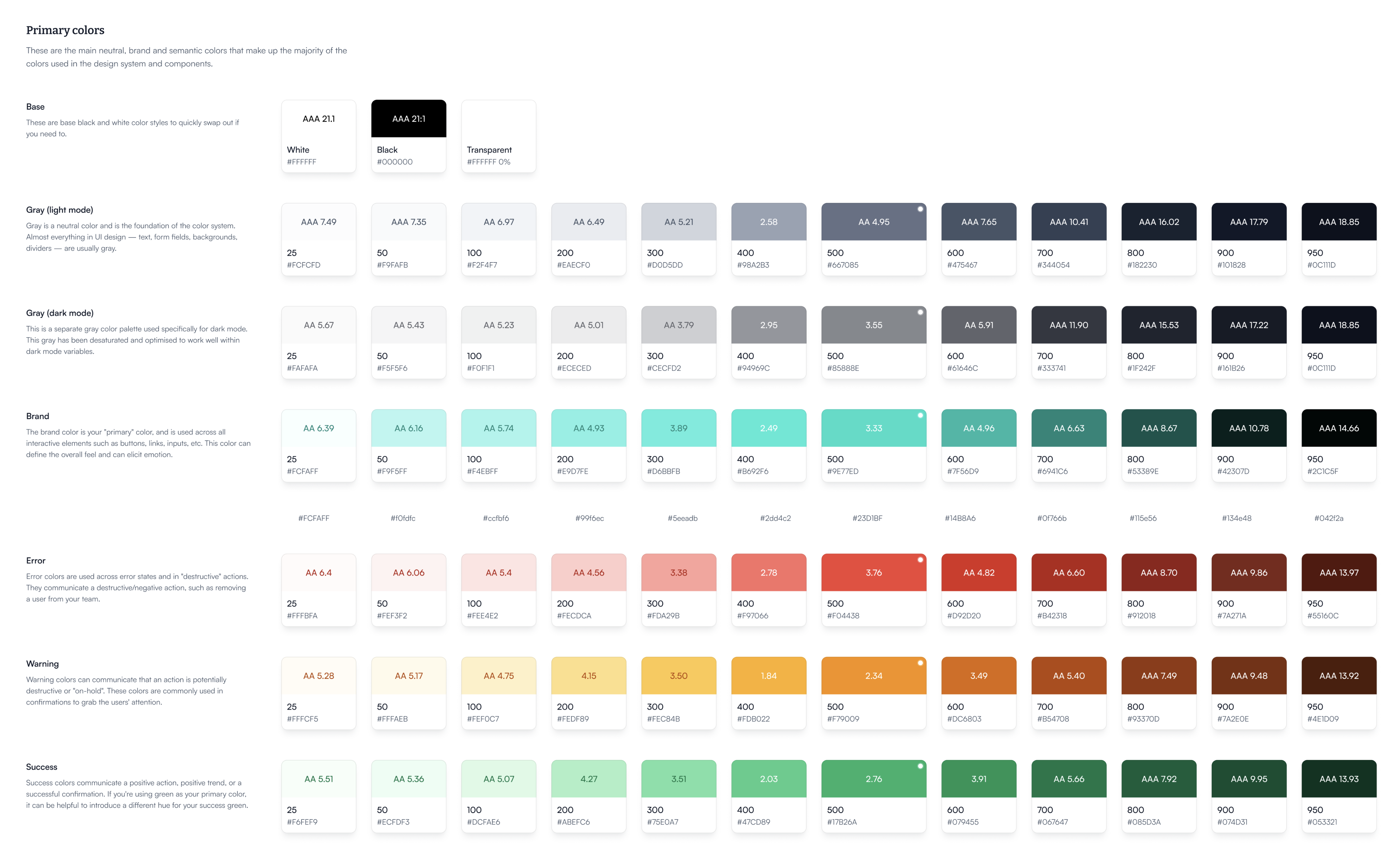
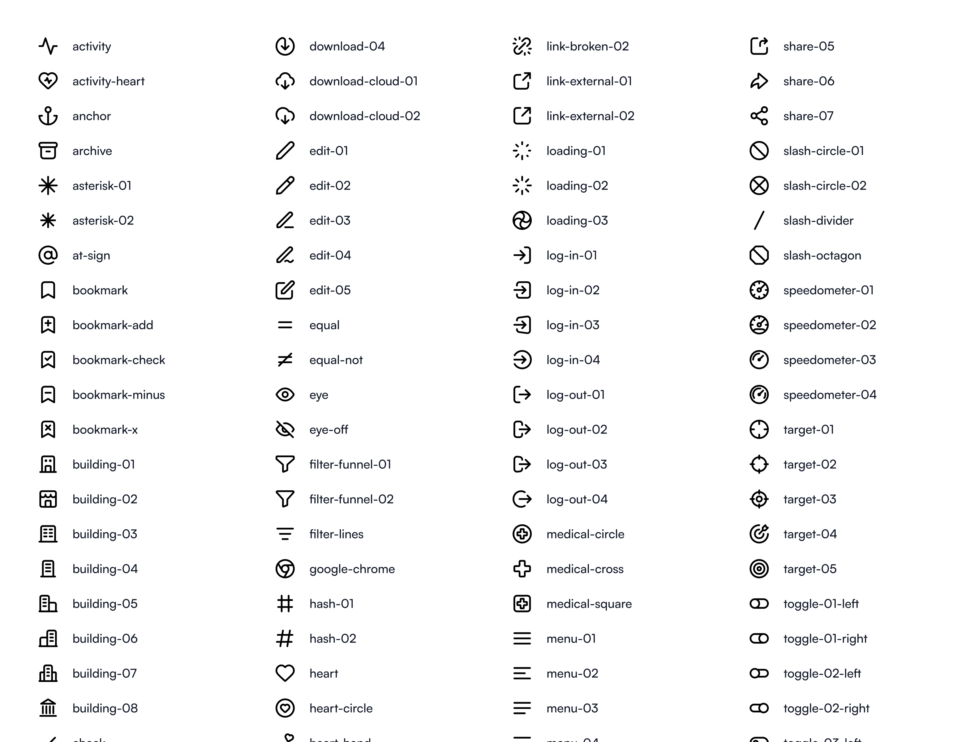
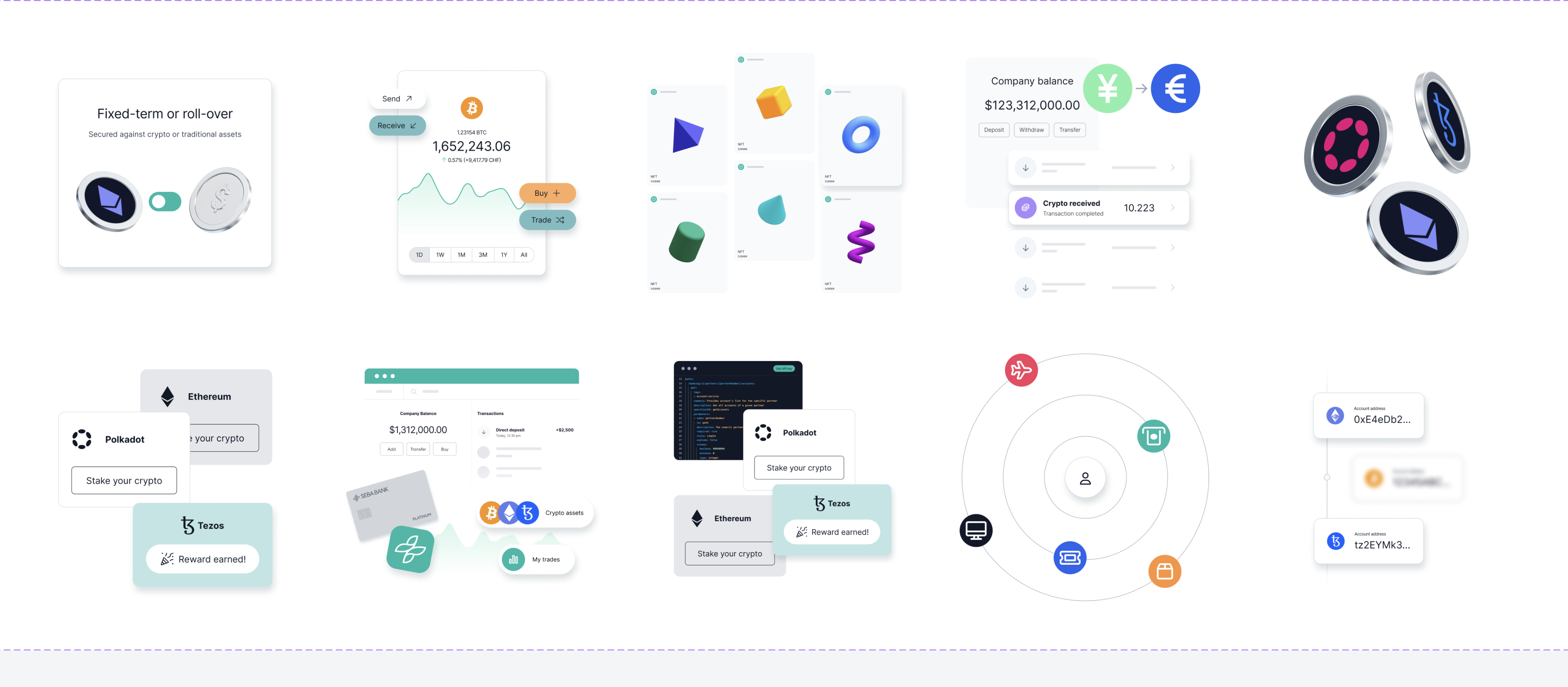
Shared foundational elements used across the web and mobile design systems
Amina design system for web
Amina design system for mobile
What sits at the bottom
The colour work is where the most care went. Every step of every ramp carries its contrast rating, so the person picking a colour can see whether it clears AA or AAA without leaving the file. Greys are split into separate light and dark ramps rather than one ramp reused, because a grey that reads well on white does not read well on near-black.
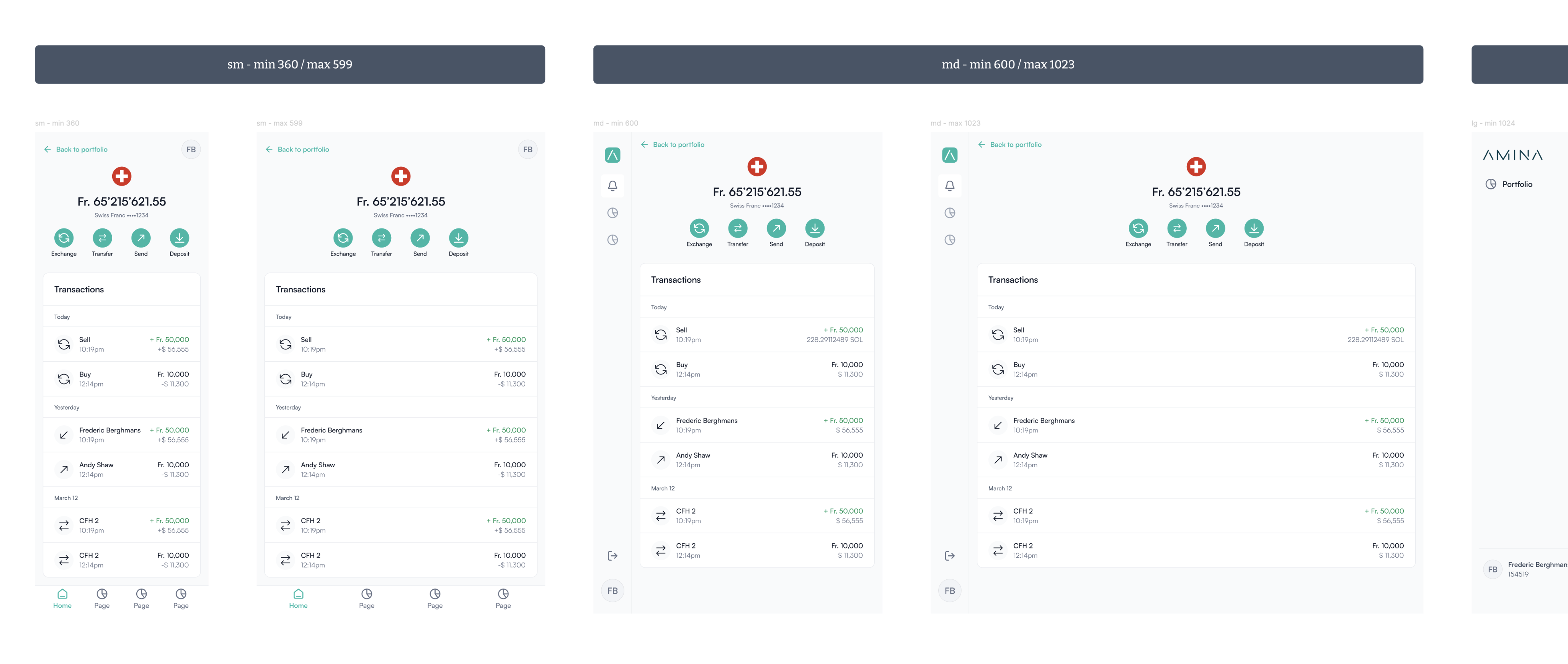
Breakpoints start at 360px, so the system is mobile first by definition rather than by intention.
Two kits on top
The web side
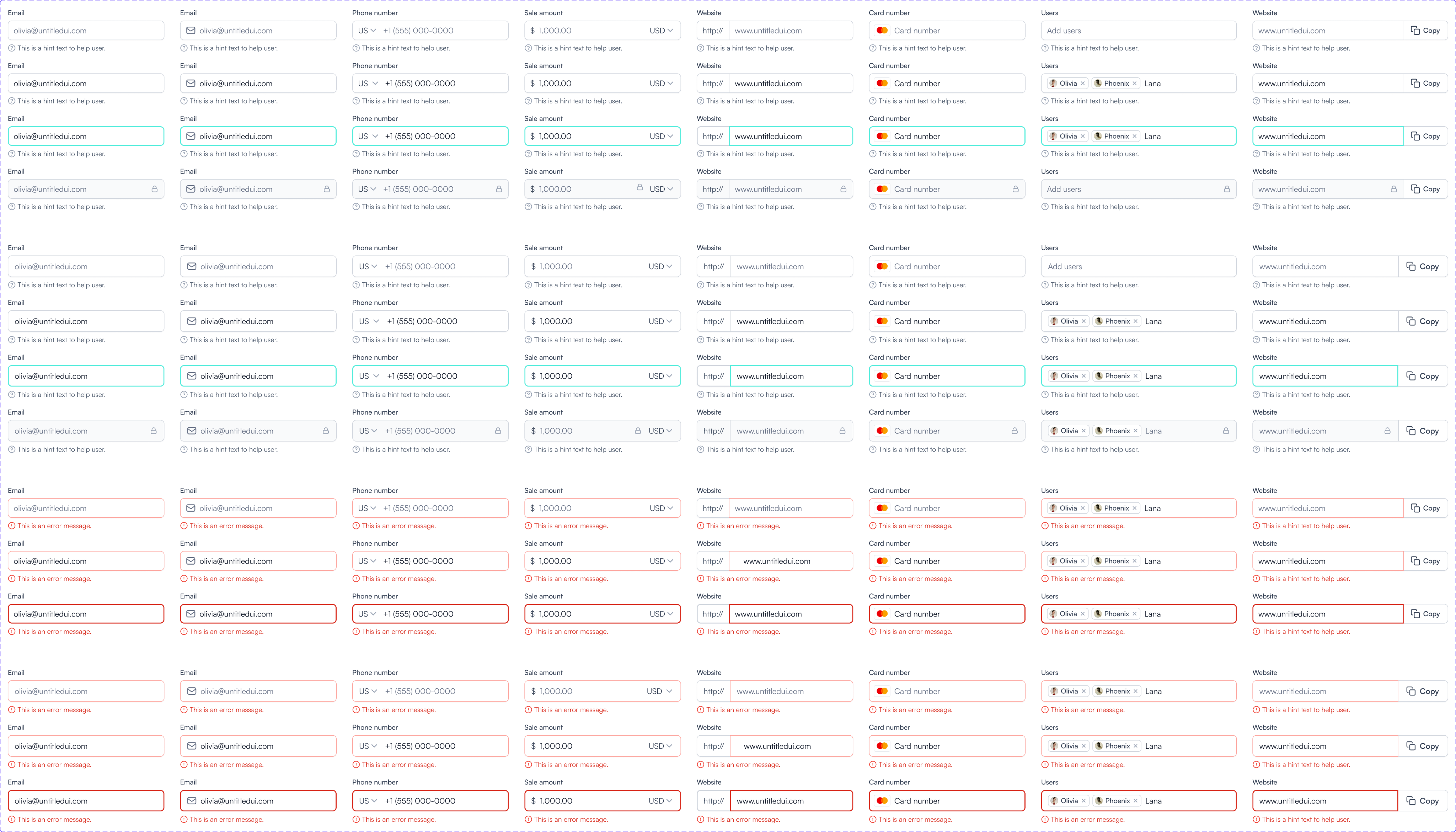
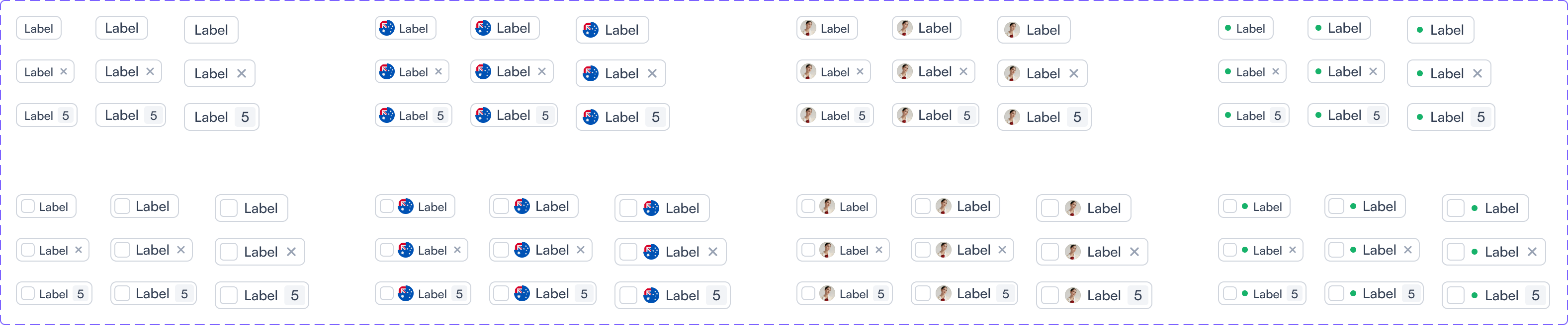
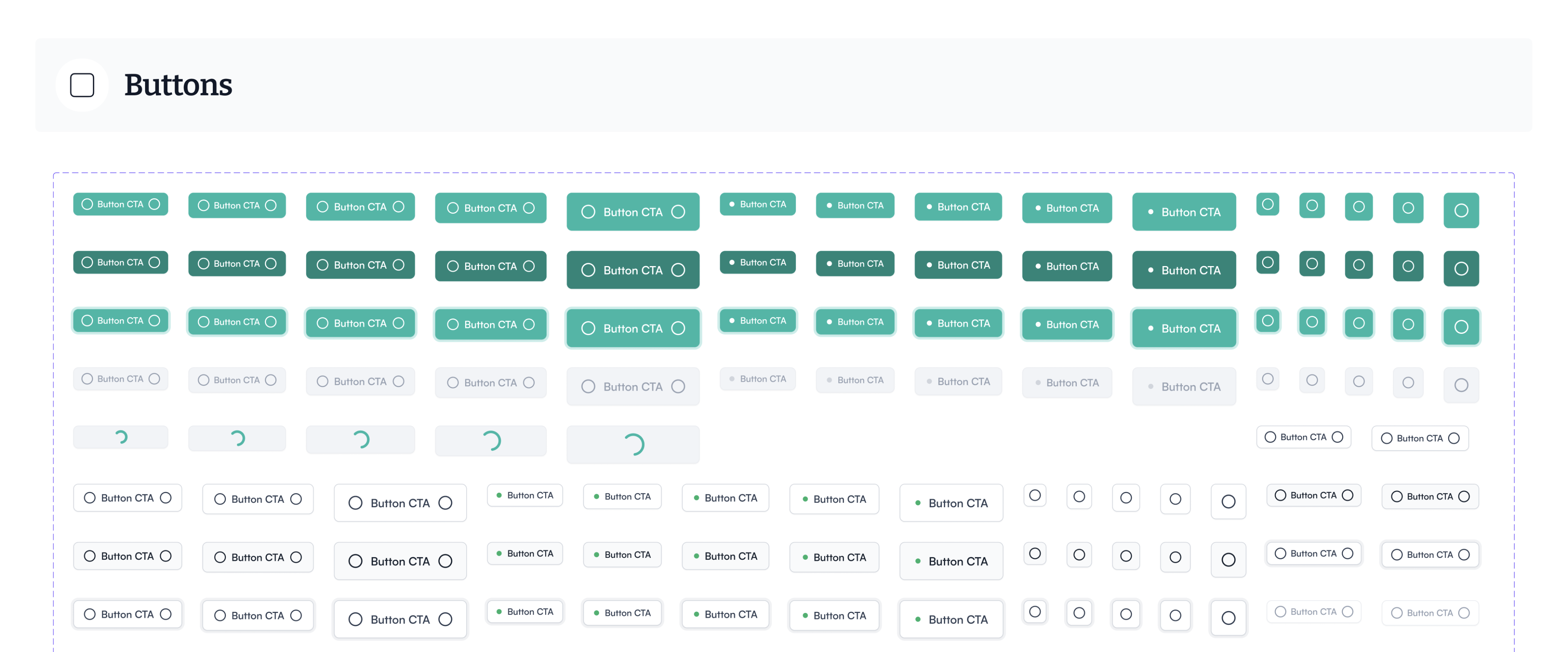
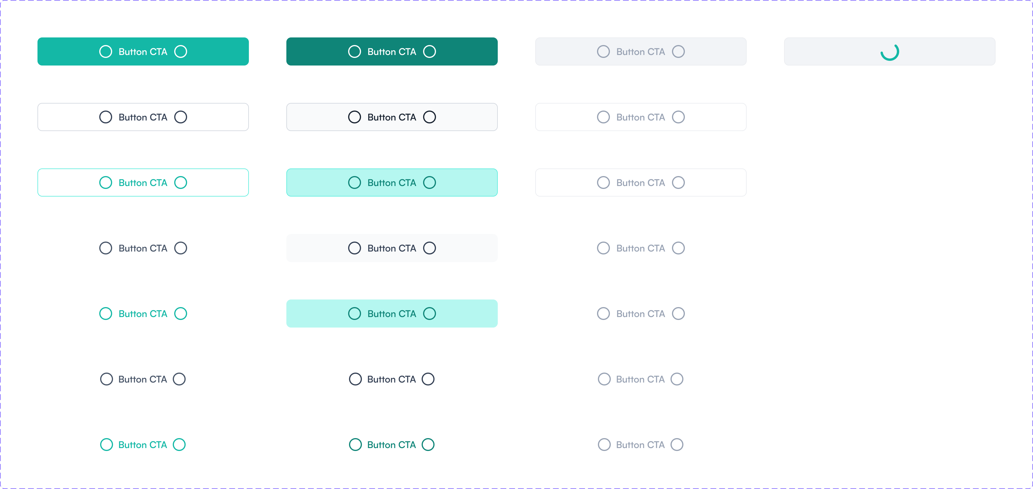
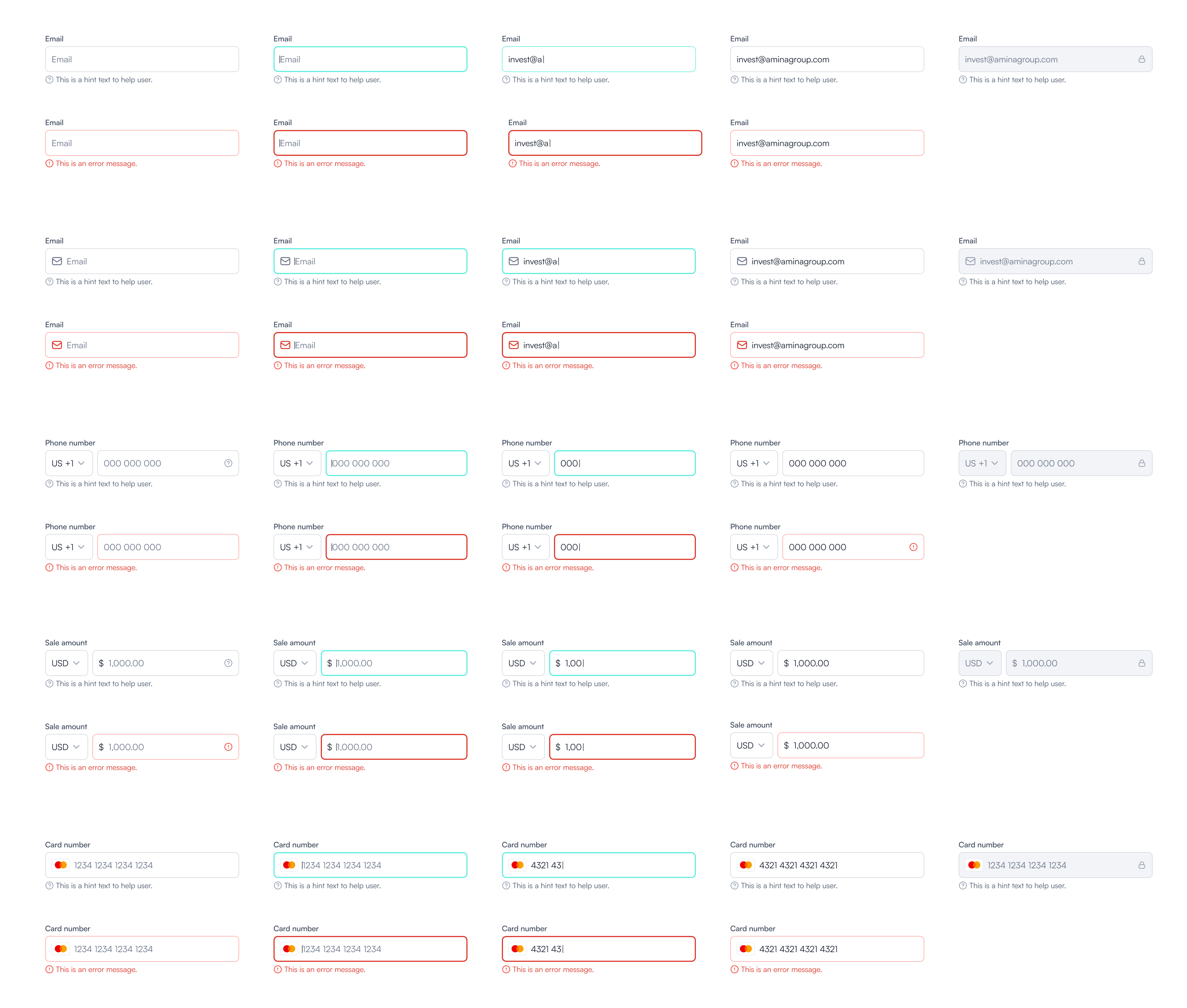
Buttons, badges, tags, dropdowns, inputs, controls, navigations, avatars, tooltips and typography. Every interactive component is drawn across its full state range, so default, hover, active, disabled and loading are decided once rather than improvised per feature.
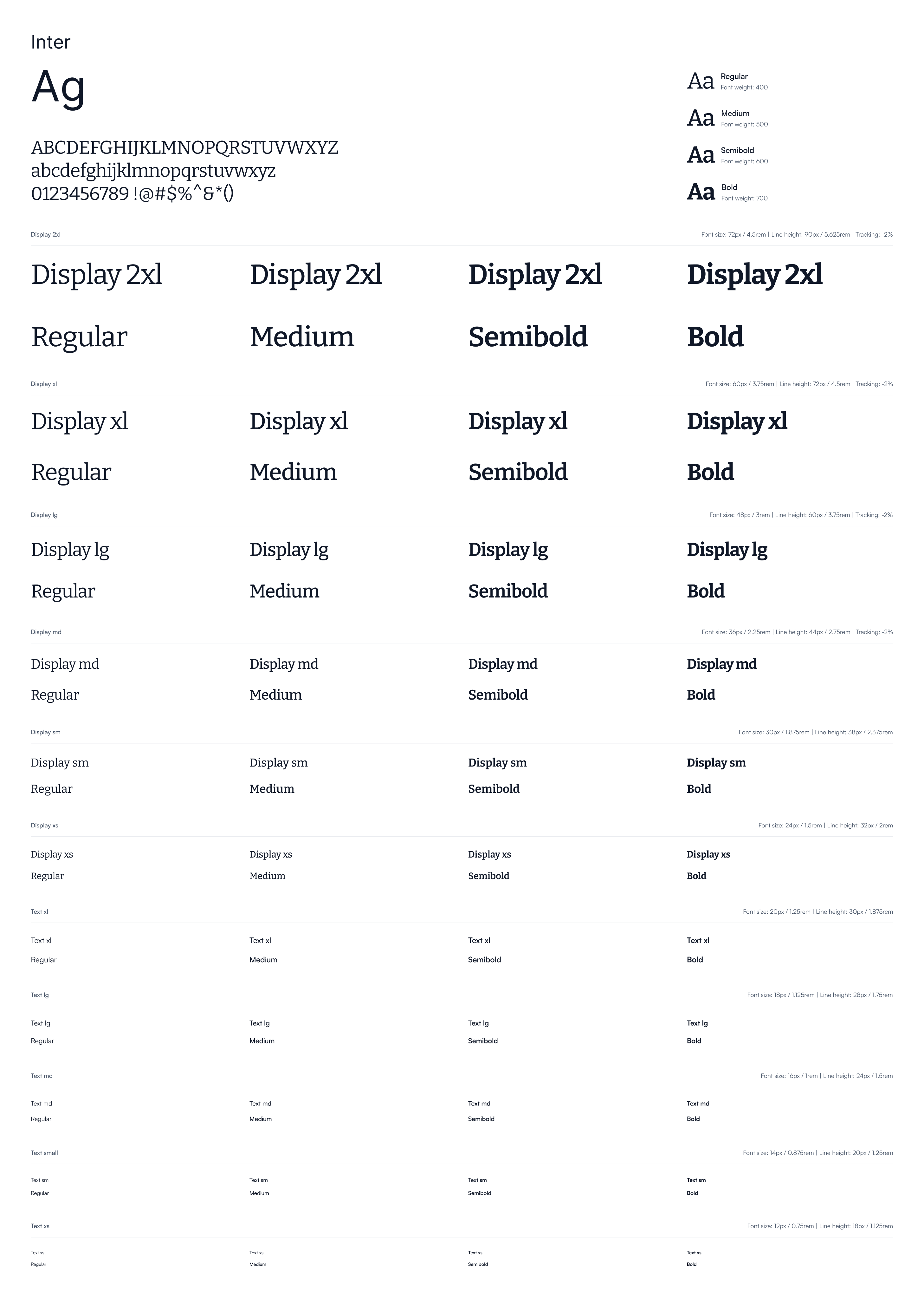
Typography is Inter across four weights, with the scale documented down from Display 2xl, each step carrying its size, line height and tracking.
The mobile side
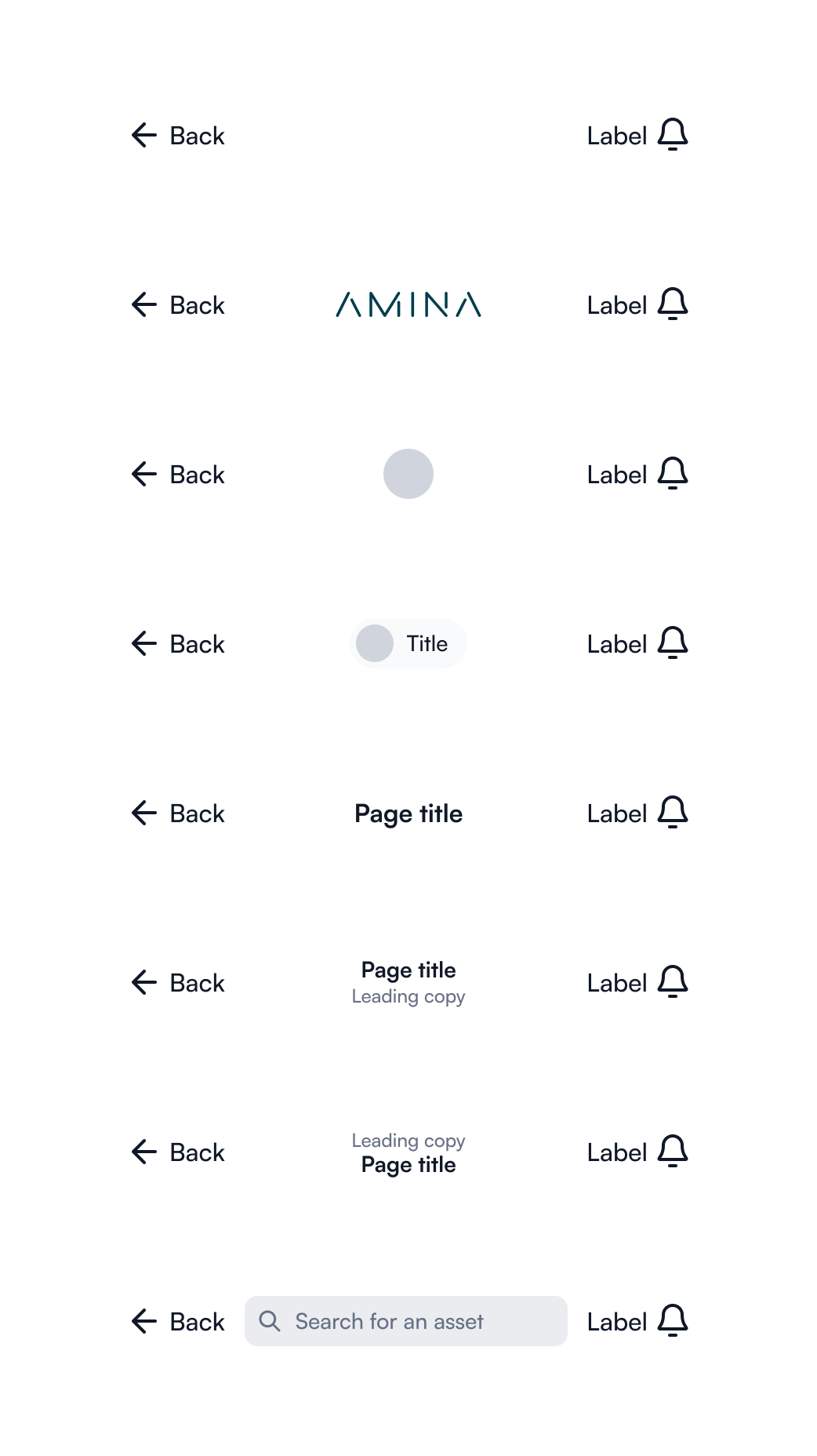
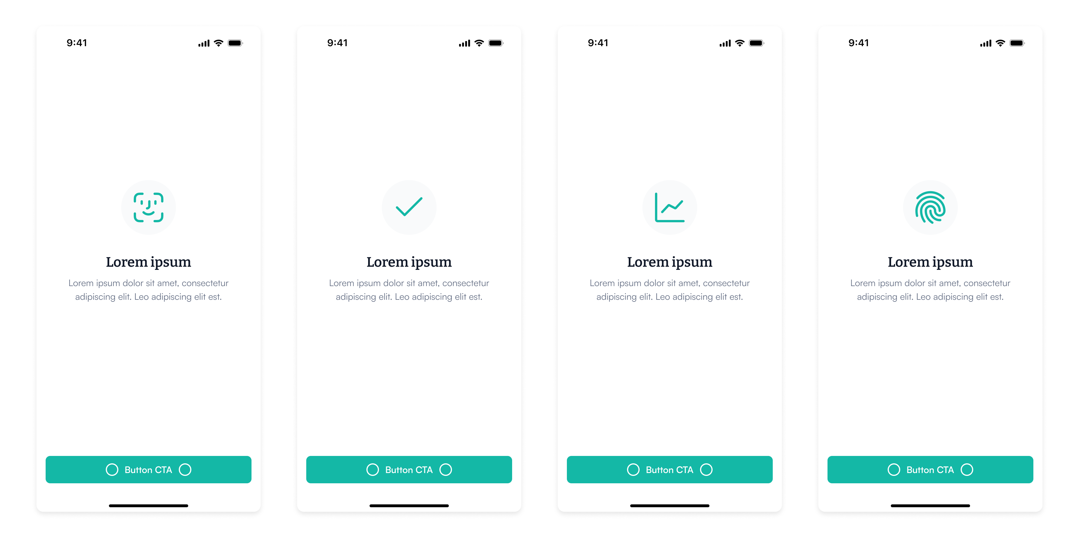
Buttons, drawers, controls, feature screens, input fields, keyboards, list items, navigation and typography. The mobile kit carries things the web kit has no use for, keyboards and feature screen templates among them, which is the argument for two kits rather than one set stretched across both.
Two layers of colour, not one
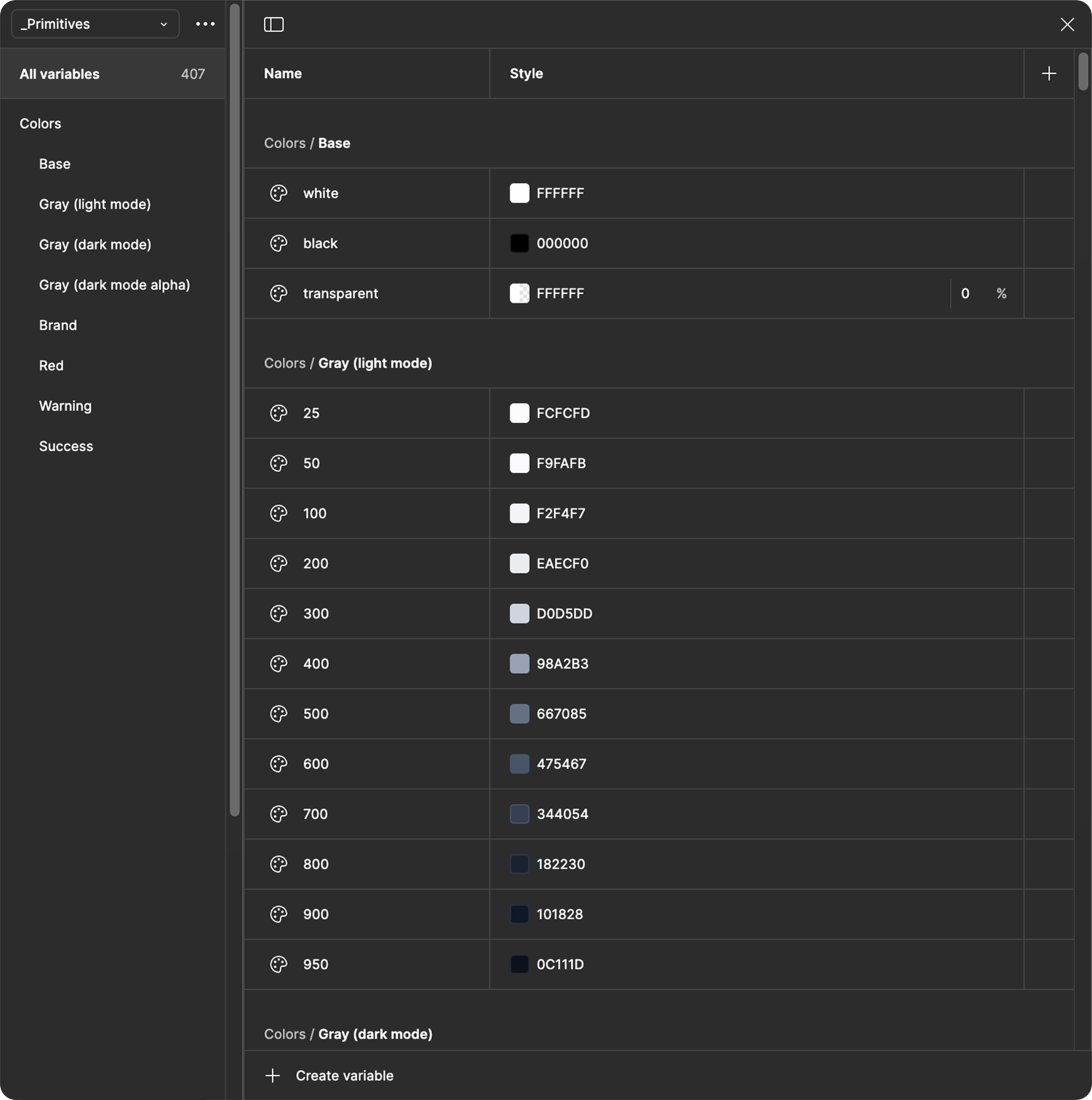
We implemented colour variables and tokens to build a scalable and theme-able design system. By defining a structured approach to colour management, we ensured consistency across all products while allowing for easy updates and customisation.
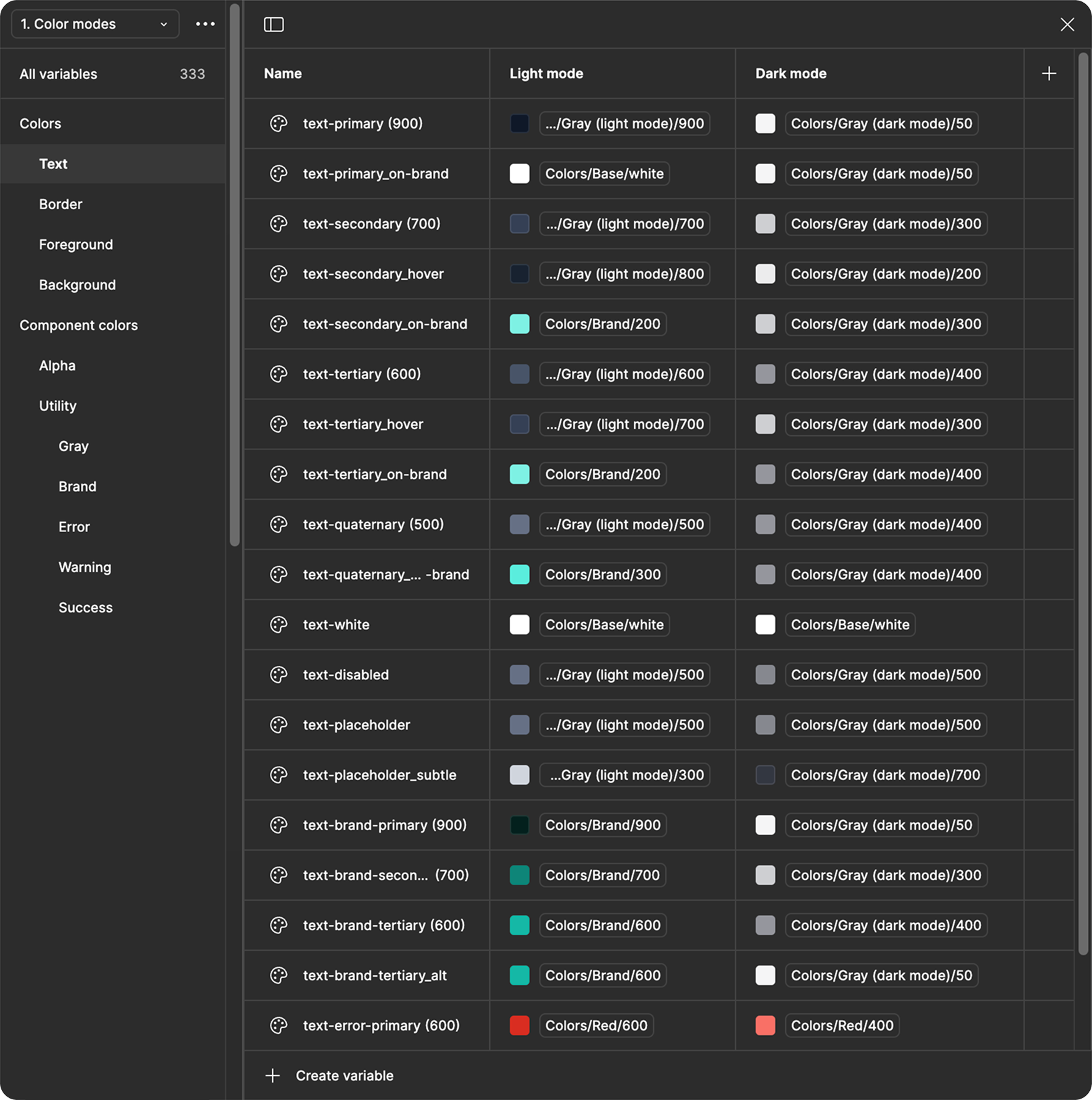
The structure is what makes it work. Raw values live in one collection, _Primitives, which holds every step of every ramp as a hex value and nothing else. A second collection, 1. Color modes, holds the semantic tokens: text-primary, text-placeholder, text-error-primary and the rest. Each semantic token maps to a light mode primitive and a dark mode primitive.
A component never references a hex value. It references a role. The mode decides what that role resolves to. That is why light and dark are the same components rather than two sets. It is also why a rebrand or a new mode is a change to one layer rather than a sweep through every screen.
The same screen, both modes
This system not only simplified collaboration between design and engineering but also enabled seamless theming, making it easy to adapt the design for different brands, modes or user preferences.
The portfolio screen is the clearest proof of it. Cash, crypto and stocks in one list, values in CHF with Swiss formatting, gains and losses carrying the semantic colours. One component set, two modes, no duplication.
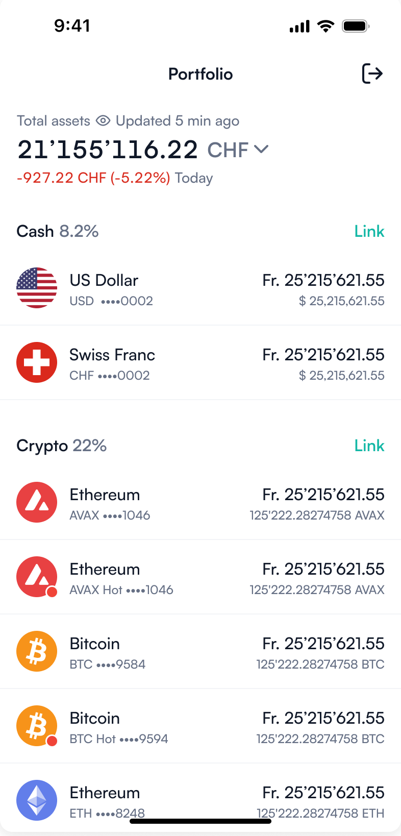 Light
Light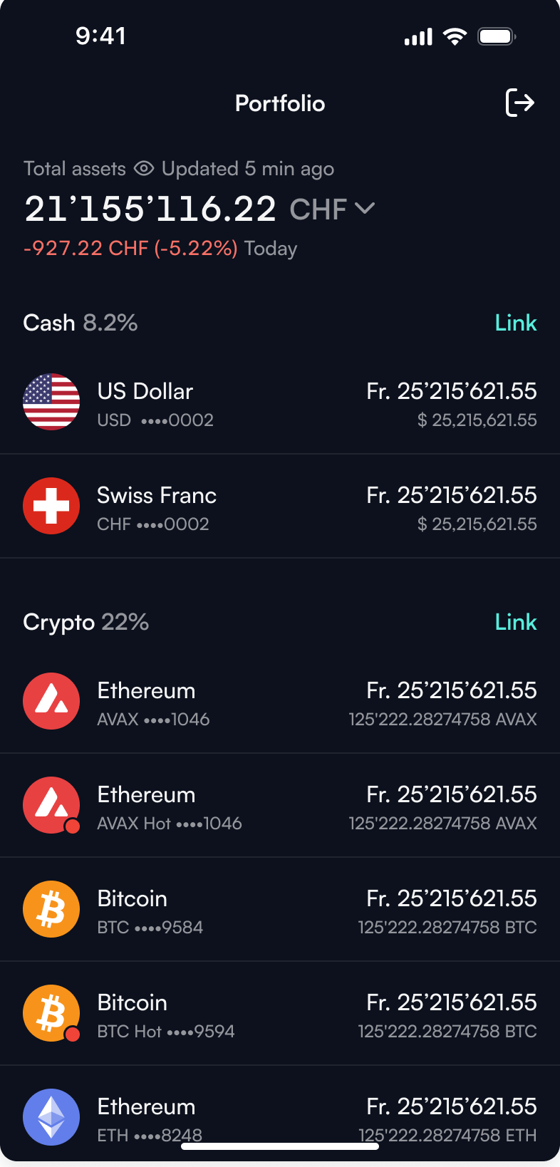 Dark
DarkAdopted in full, by both teams
There was no system before this one.
Testimonials
“Working with Khayam has been a pleasure. He’s one of the most proactive designers I’ve worked with, always stepping up to take ownership of challenges. Khayam led our design system, defined mobile-first patterns, and ensured best practices in highly regulated areas like crypto banking. He creates thoughtful, user-first solutions, tells compelling design stories, and consistently brings attention to detail. His ability to work autonomously in complex environments and his deep understanding of design thinking made him a major asset to our team. I highly recommend Khayam as a top-tier product designer.”