
Making cyber risk legible at a glance
- Client
- DCS
- Role
- Senior Product Designer
- Year
- 2026
- Tags
- Design system, Accessibility, Web, UI
The claim the interface had to hold up
The platform continuously monitors an organisation's internal and external environment, surfaces vulnerabilities and exposures and turns them into something a leadership team can act on. The proposition is that cyber risk is a business risk, not just an IT problem.
If a user cannot tell at a glance what is critical, what changed and what to do next, the product has collected data without delivering visibility. That was the gap I was brought in to close.
What I found
I began with an analysis of the shipped product, version 1.4.13. The summary dashboard was the clearest expression of the problem. It was failing in ways that were structural rather than cosmetic.
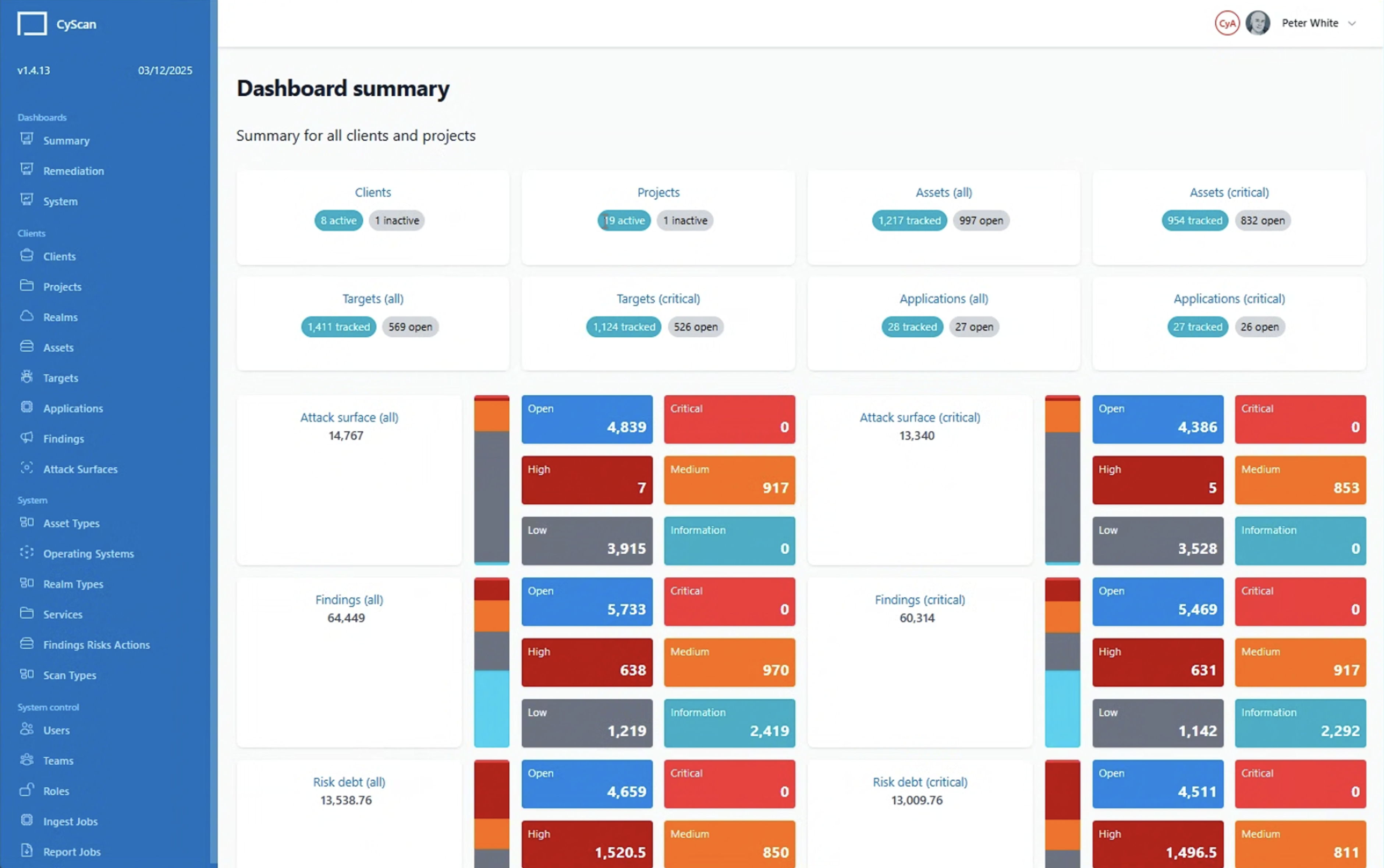
The system encoded the wrong variables
The interface was not hard to read because it was unattractive. It was hard to read because the visual system encoded the wrong variables. Size meant nothing, colour meant three things and totals looked like parts.
That reframing told me where the work was. It also told me where it was not.
A UI-scoped rebuild
Three months, one front-end engineer and a product already in use.
The statement of work was explicit: no changes to existing functionality at this stage, with functional opportunities left to a future phase. The information architecture was not in scope either. The navigation, the object model of clients, projects, realms, assets, targets, applications, findings and attack surfaces, plus the data structure underneath, all stayed as they were.
An inception phase set the rest. Stakeholder input, a page-by-page review and an agreed set of screens to upgrade, with room to adjust the mix as the review found things.
That constraint fitted the problem. What the product contained and how it was organised were not what made it hard to read. How it was rendered was. So the entire improvement had to come from the visual system: encoding, hierarchy, colour, typography and layout.
It also meant the engineer could rebuild against a component library without waiting on structural decisions, which is what made twelve weeks viable.
A design driver, not a compliance step
Some of CyScan's users have dyslexia. That was not a hypothetical persona or a checklist item. It was a known characteristic of people using the product daily. It moved legibility from a quality bar to a core requirement.
The existing interface was close to a worst case: small white text on large saturated grounds, competing surfaces and pure white against pure black in equal measure. High-saturation backgrounds are a known source of visual strain for dyslexic readers. Maximum black-on-white contrast can produce the same effect.
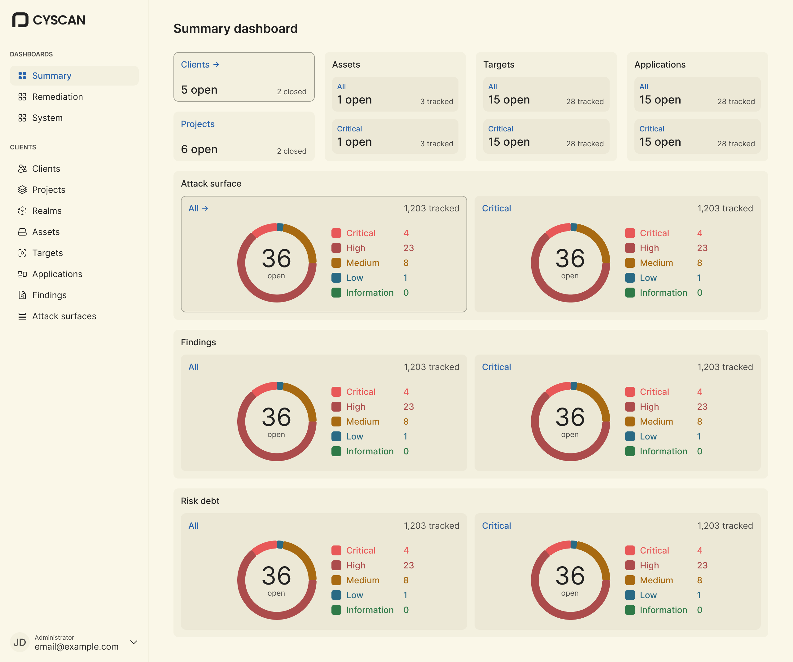
I built a four-theme system from two independent, user-controlled toggles, dark mode and accessibility mode, giving Dark, Light, Dyslexia (Dark) and Dyslexia (Light).
Accessibility is a user preference sitting beside dark mode, not something buried in settings or inferred from a profile flag.
Typography is identical across all four themes. The variants are entirely colour. That was deliberate: a user switching modes gets a genuinely equivalent interface, not a separate and lesser one.
What changes is the ground and the ramp.
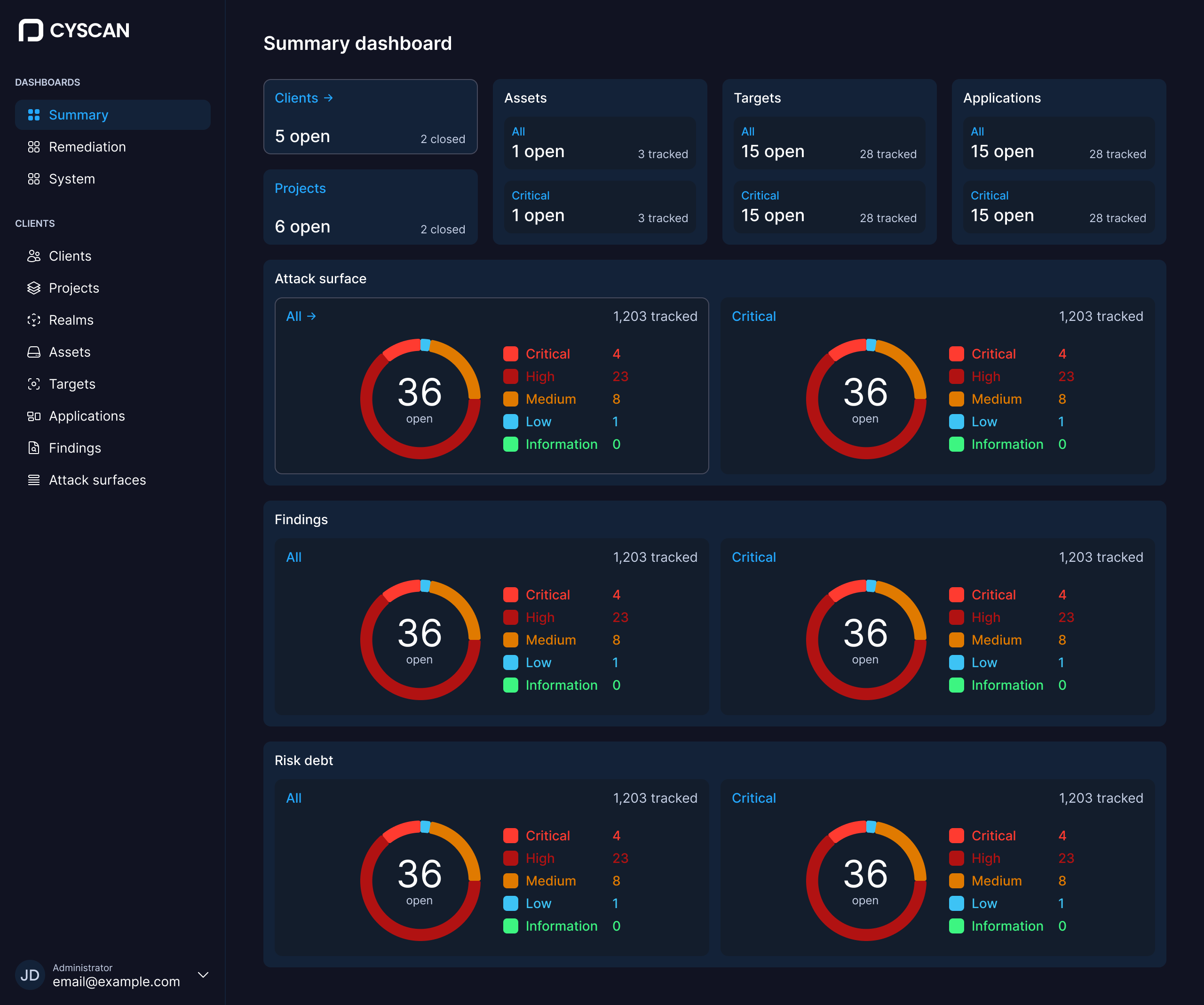 Dark
Dark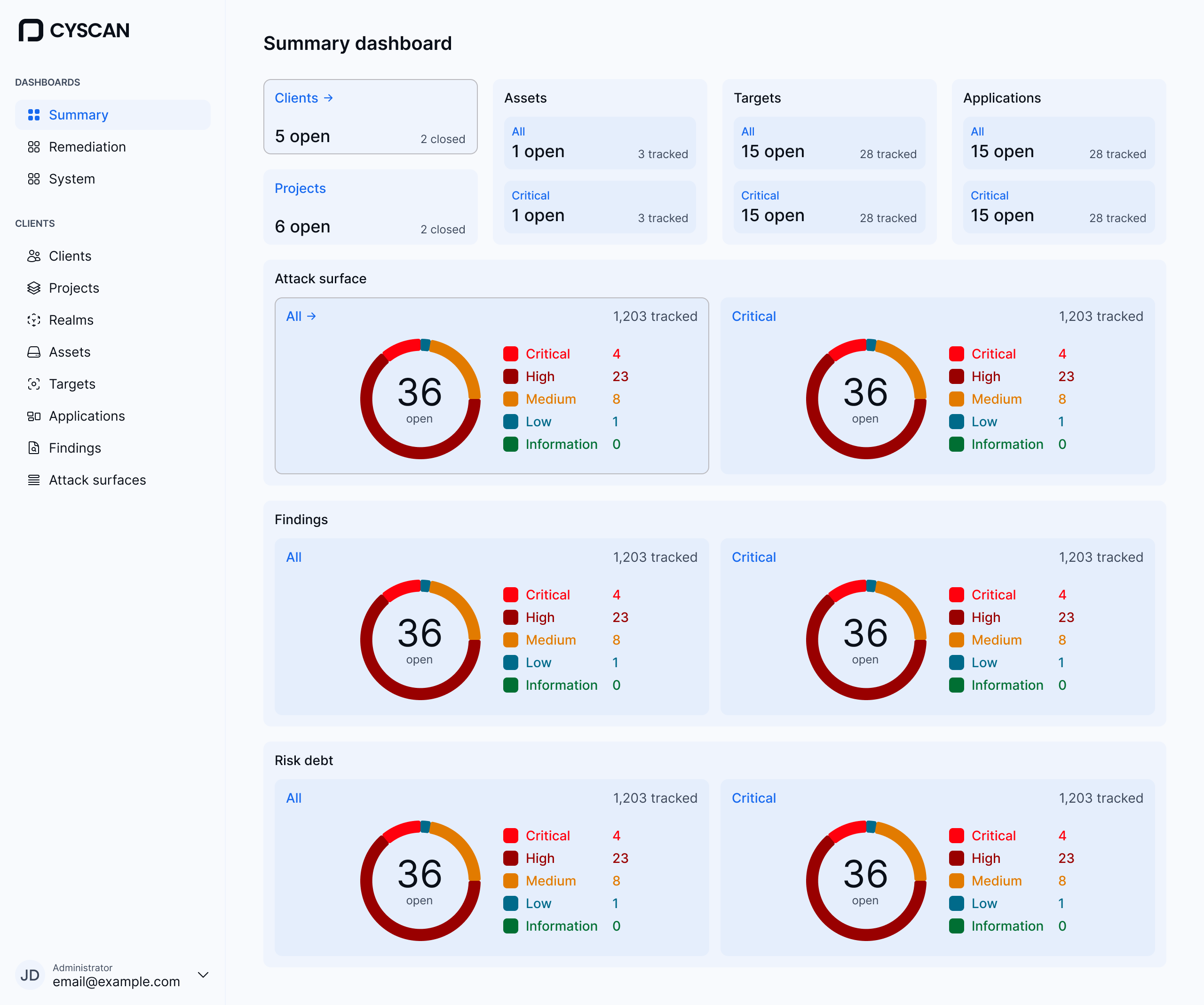 Light
Light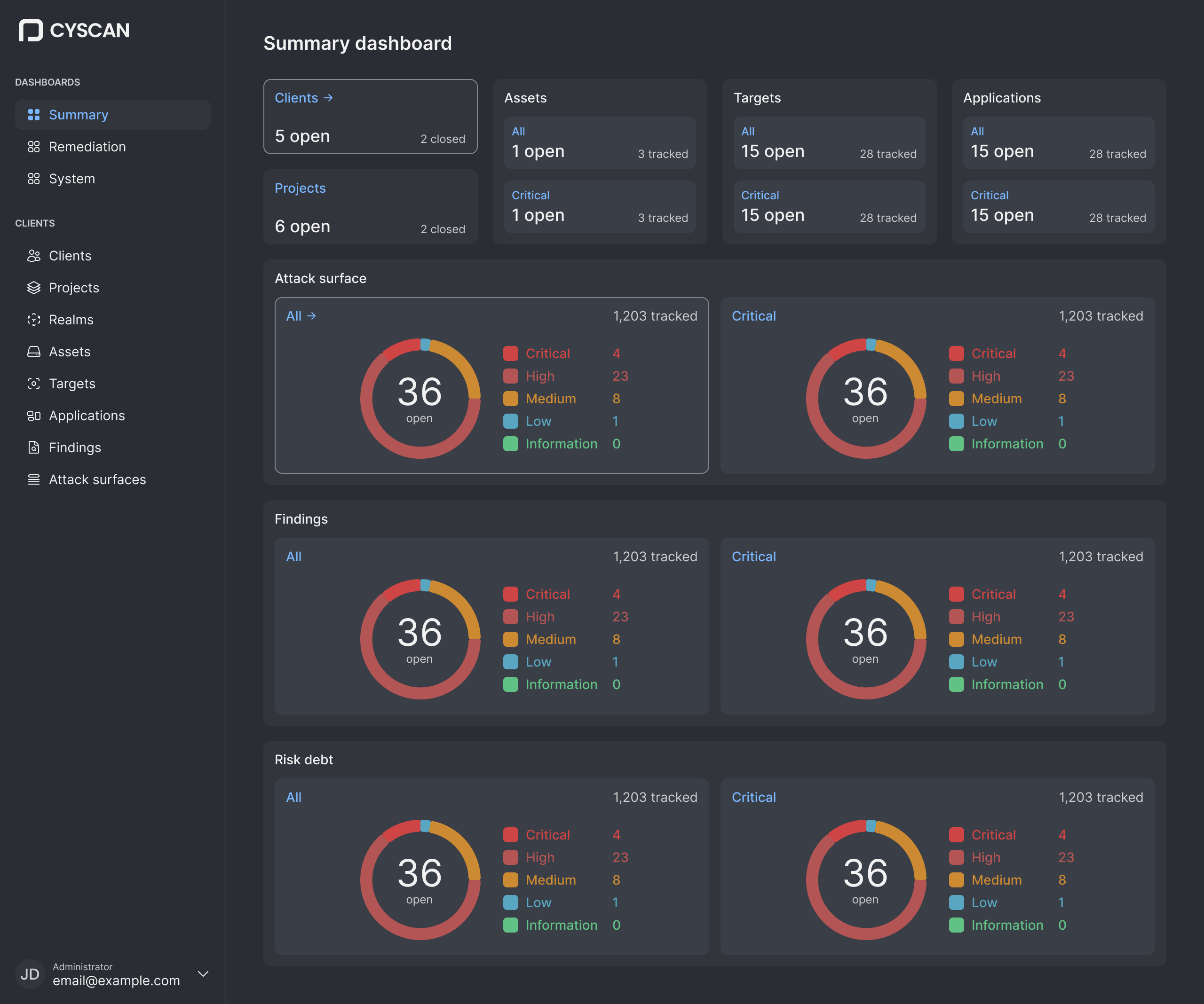 Dyslexia (Dark)
 Dyslexia (Light)
One naming decision is worth stating. The token system names the variants after dyslexia, but the user-facing control says Accessibility mode. Nobody should have to identify themselves as dyslexic to a piece of software to get a legible interface. The internal name describes the design intent. The external label describes the choice.
What shipped underneath
Primitives resolved through semantic groups
I built the palette as primitives resolved through semantic groups, covering brand, system background, text, text inverse, status colours and borders, with each semantic token pointing at a primitive rather than a hex value. Every one of the thirty theme variables resolves across all four themes from a single definition.
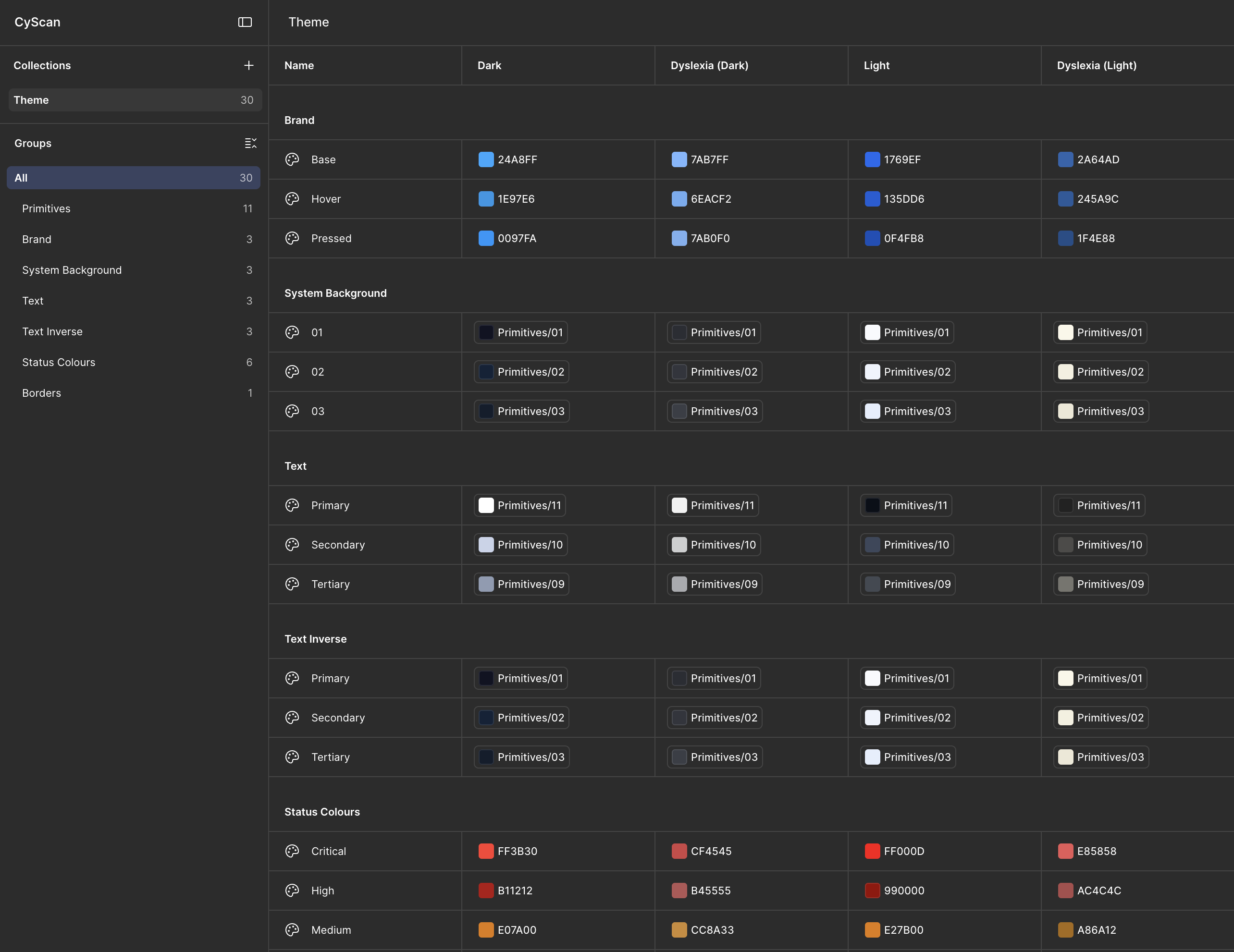
This is what made four themes affordable. Without semantic aliasing, four themes is four times the design work and four times the front-end work. With it, it is one system with four resolutions, which is the only reason a twelve-week timeline could carry an accessibility requirement at all.
Defined once, built against
The type scale was defined once and applied across all themes, enforcing consistent hierarchy on screens that previously mixed weights, sizes and number formats within a single view.
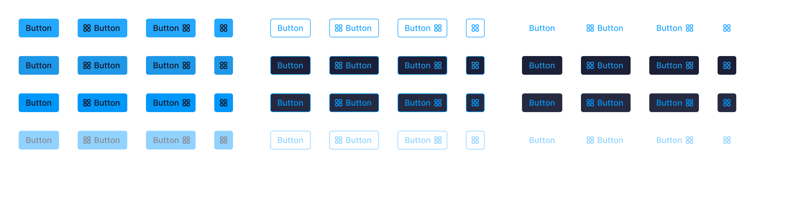
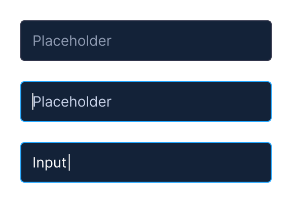
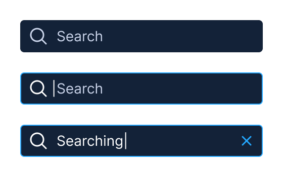
I designed and documented a component library in Figma, mirrored in Storybook by the front-end engineer: navigation items with state and count variants, tabs, cards, charts and data displays. Documenting in both meant the engineer built against a specification rather than against screenshots.
Every component was documented with its full state matrix, so theme behaviour was verifiable per component rather than caught late at page level.
Pinning content on wide displays
I defined breakpoints from tablet through to extra-large displays. Beyond 1280px, content pins centrally rather than continuing to stretch. Dashboards on wide monitors keep a readable line length and a stable scan path instead of dispersing across the viewport. On a data-dense product where users scan rather than read, that is a legibility decision as much as a layout one.
The redesign
Magnitude carried by the mark
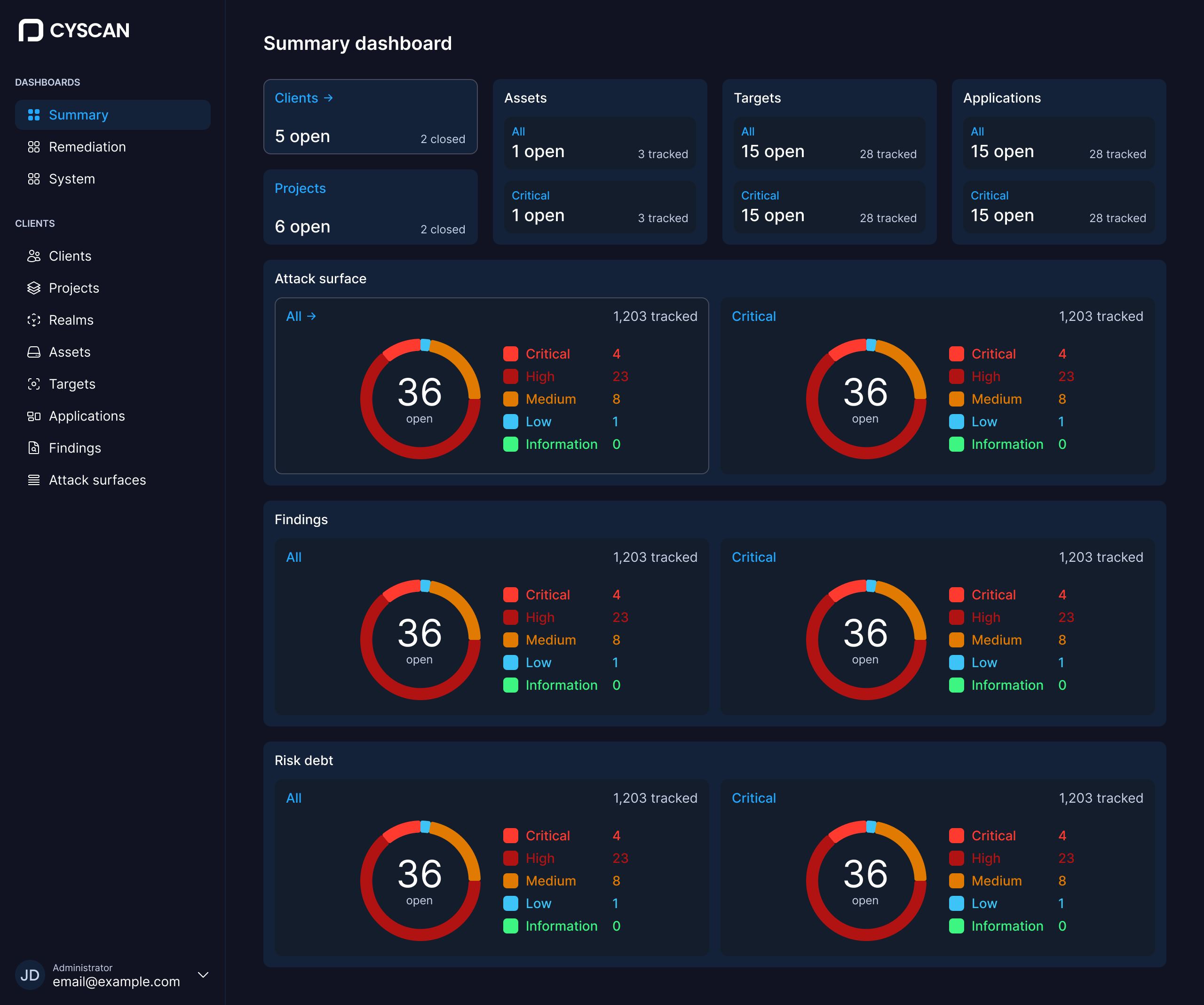
Severity is now carried by a proportional mark. Attack surface, findings and risk debt each read as a single ring with the breakdown beside it, so magnitude is expressed by the chart rather than by identically sized coloured blocks. The charts are standard high-performance components rather than bespoke visualisations, which keeps them fast on a data-dense page and maintainable by the team after handover.
Colour is never the sole carrier of meaning. Every severity appears as a swatch, a text label and a value together. That holds for colourblind users, in greyscale and under both reduced-intensity themes.
Chrome and data are separated in the palette, so interface colour no longer competes with severity colour for the same channel.
The dimension the old product had nowhere
The most substantial gap I found was the absence of change over time. A platform selling continuous monitoring showed only a present-tense snapshot.
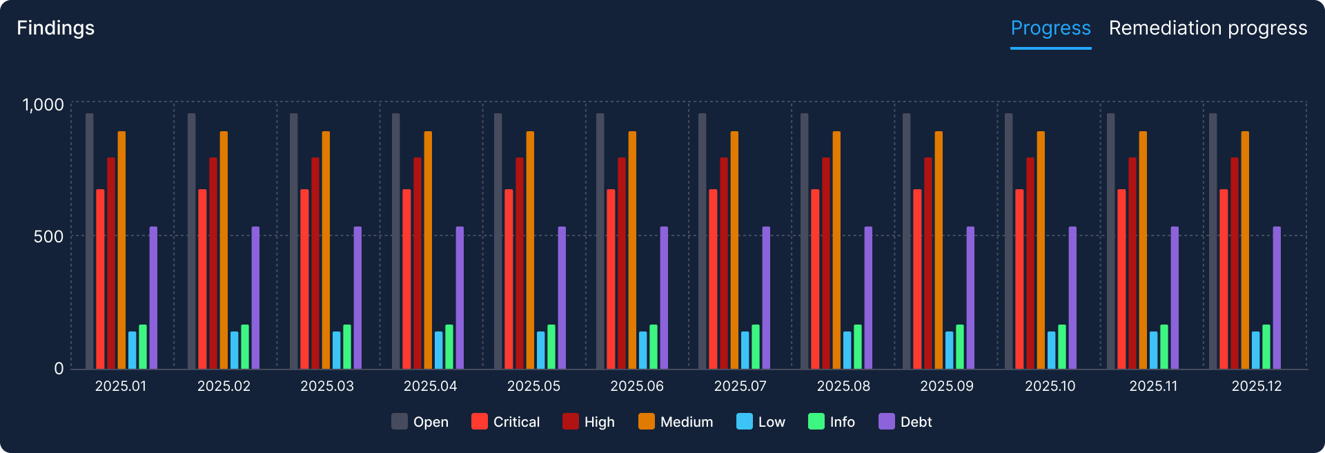
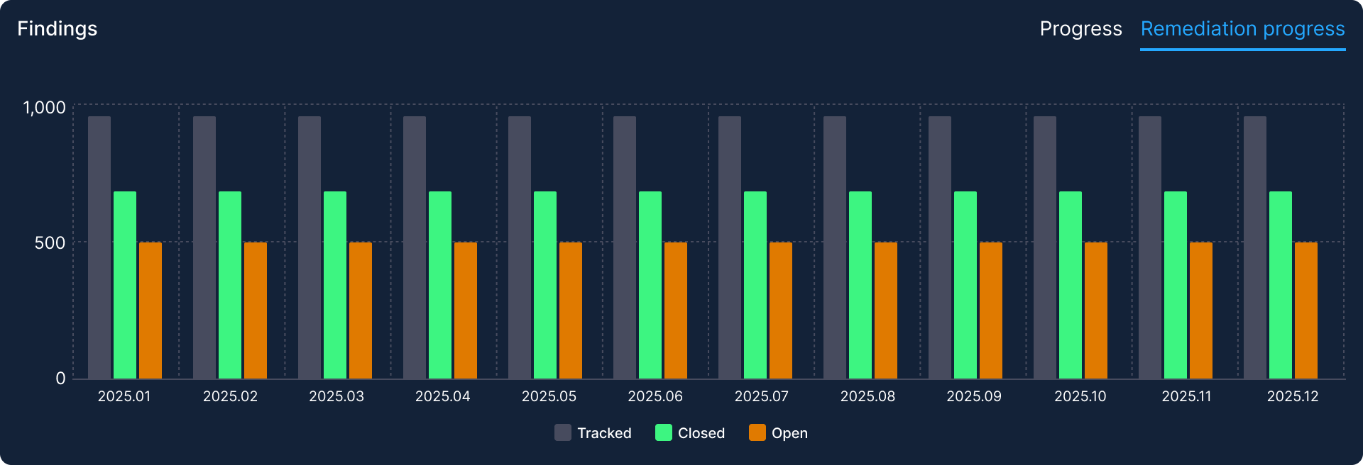
Findings are now plotted across twelve months by severity, with a second tab showing remediation progress: what is tracked, what has been closed and what remains open. That pairing answers two different questions with the same component. How exposed are we and are we actually fixing things.
Standard and executive views
The client screen carries two views behind a segmented control in the header. Same client, same data, two entirely different framings of it.
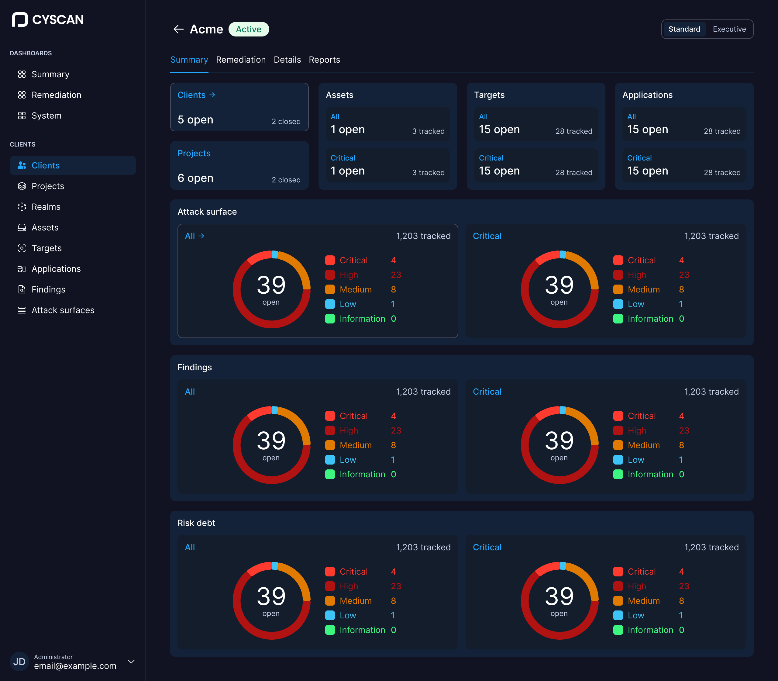
Standard is the working view. It opens on the full severity breakdown across attack surface, findings and risk debt, with tabs through to remediation, details and reports. Everything needed to move from a number to a specific finding to an action is on the screen or one click from it. This is for the person whose job is to fix things.
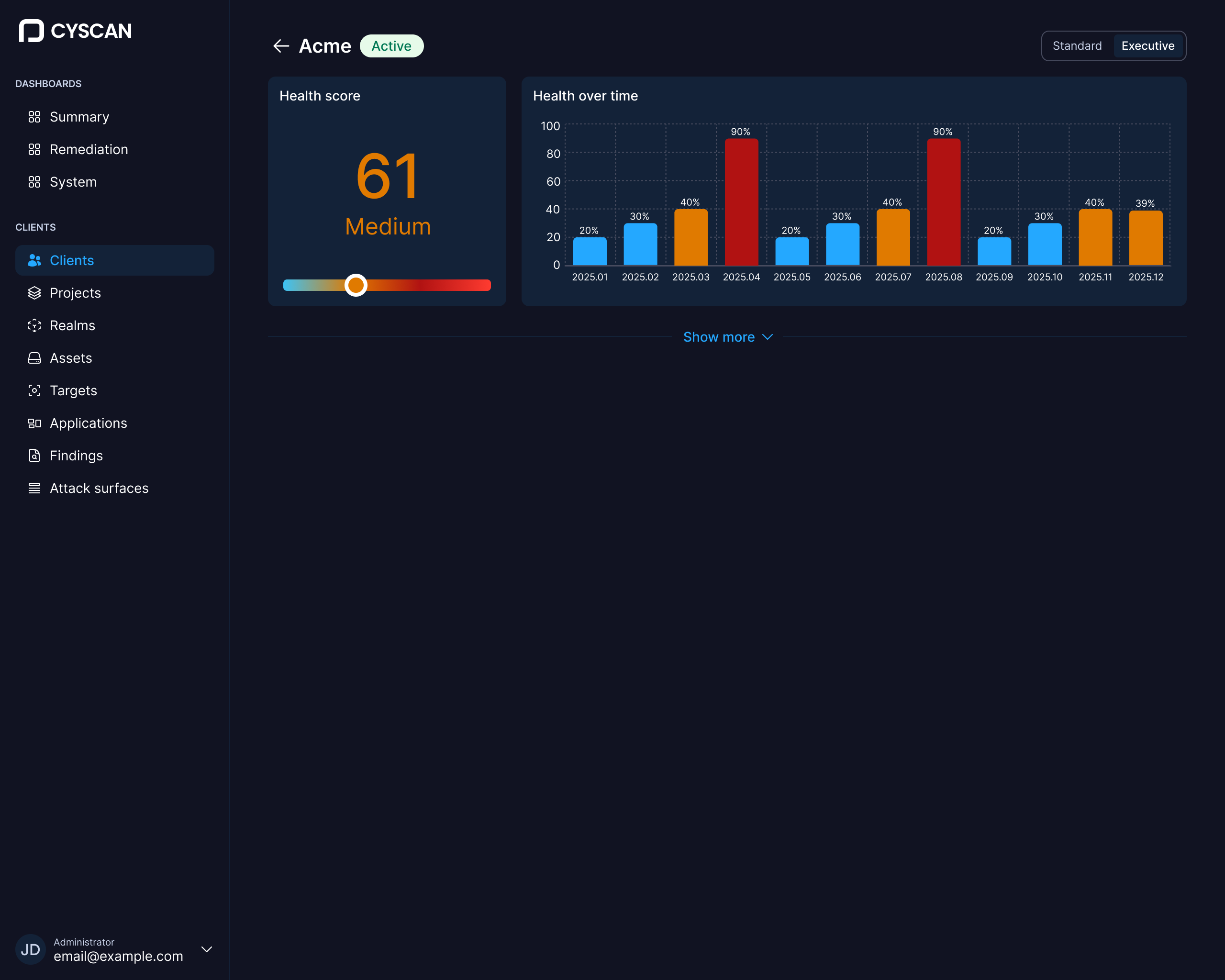
Executive strips all of that away. New summary pages for non-technical stakeholders were a defined deliverable. DCS brought the health score forward as the business need behind them. Leadership wanted a single number that answered how exposed are we without requiring interpretation.
My work was deciding how that number should behave as an interface: that it carries a severity grade rather than standing alone, that it sits on a visible scale so the number has context instead of needing to be memorised, plus that it is paired with health over time so the reader sees direction of travel alongside position. That pairing is the whole first screen. An executive gets where they stand and which way it is moving without reading a single finding.
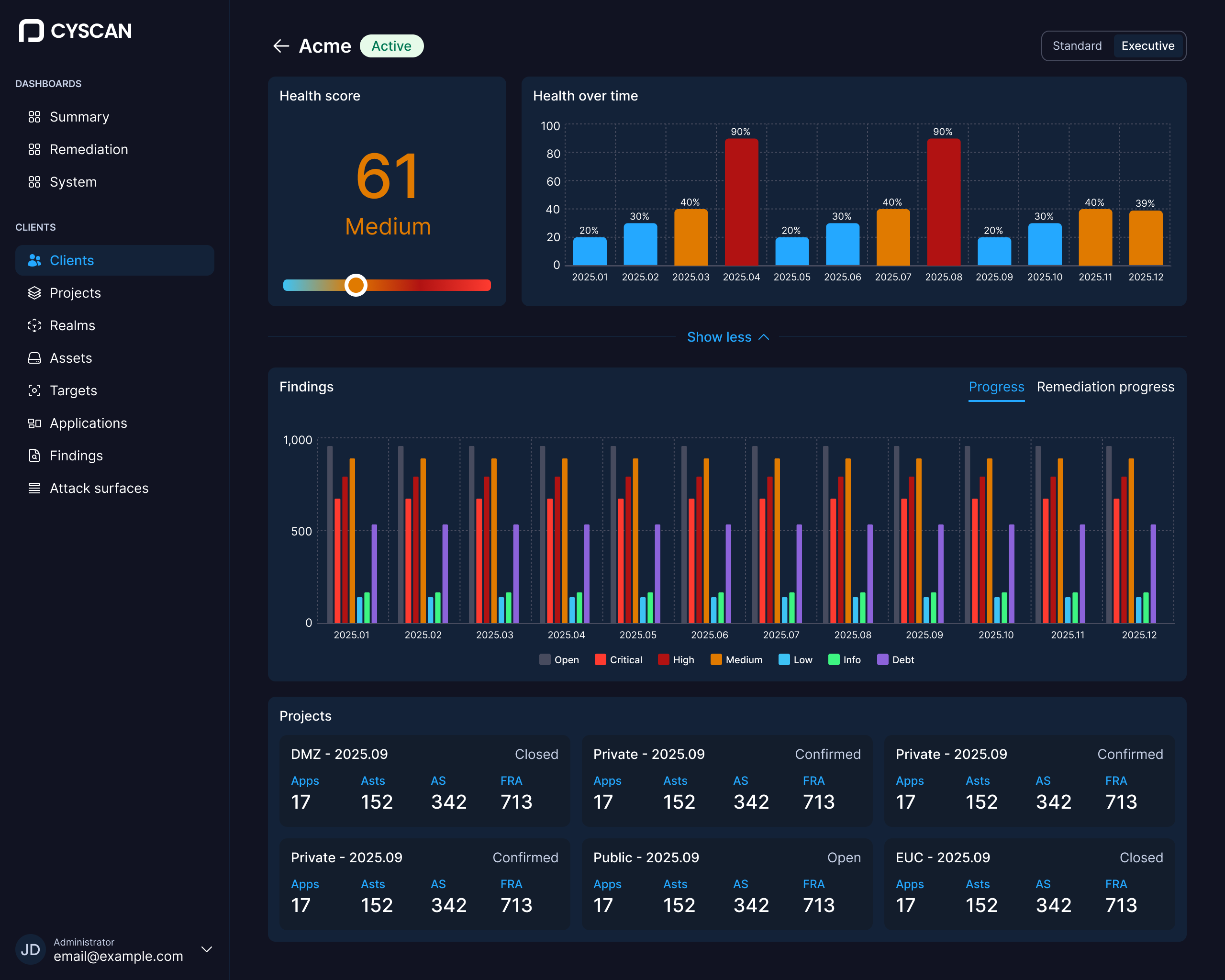
This is where the product's commercial argument becomes an interface decision. If cyber risk is a business risk, a board-level user has to read the risk position without first becoming a security analyst. The design problem was not building a second product. It was deciding what an executive does not need to see, which is a harder question than what they do.
Keeping the business in the room
The Chair, CEO and CTO joined regular review sessions across the engagement. On a three-month rebuild with a single engineer, that cadence kept scope honest. Decisions were made in the room rather than deferred. The product's commercial framing stayed connected to interface decisions rather than being reconstructed afterwards.
The theme system was reviewed by the client's team via a structured document covering all four variants. It came back with positive feedback and no change requests.
Leaving it buildable
Key flows were prototyped in Figma at a basic level, enough to demonstrate interaction intent without implying any change to how the product works. The engagement closed with a complete Figma file holding the design system and every updated screen, handover notes written for the developers implementing it, then a final walkthrough with the stakeholders who had been in the reviews all along.