A new design system for a next generation asset management and trading platform

Role
Product Design Lead
Year
2023
Tags
Design system, Tokens, Figma, Storybook
The inception of a new design system, built to create a shared language and visual consistency between the design and engineering teams and throughout Plus Platform.
Problem

No shared language between design and engineering

Before I joined, hardcoding in various areas of the product was common. That created inconsistencies across the product and prolonged development time, because every new feature meant rebuilding decisions that had already been made somewhere else.

There was no shared language between the design and engineering teams and nothing that held the product together visually.

Approach

Building the system from its foundations up

Anatomy

What the system is made of

Typography styles
Design tokens
Colour palette
Icon library
React web components
Storybook repository
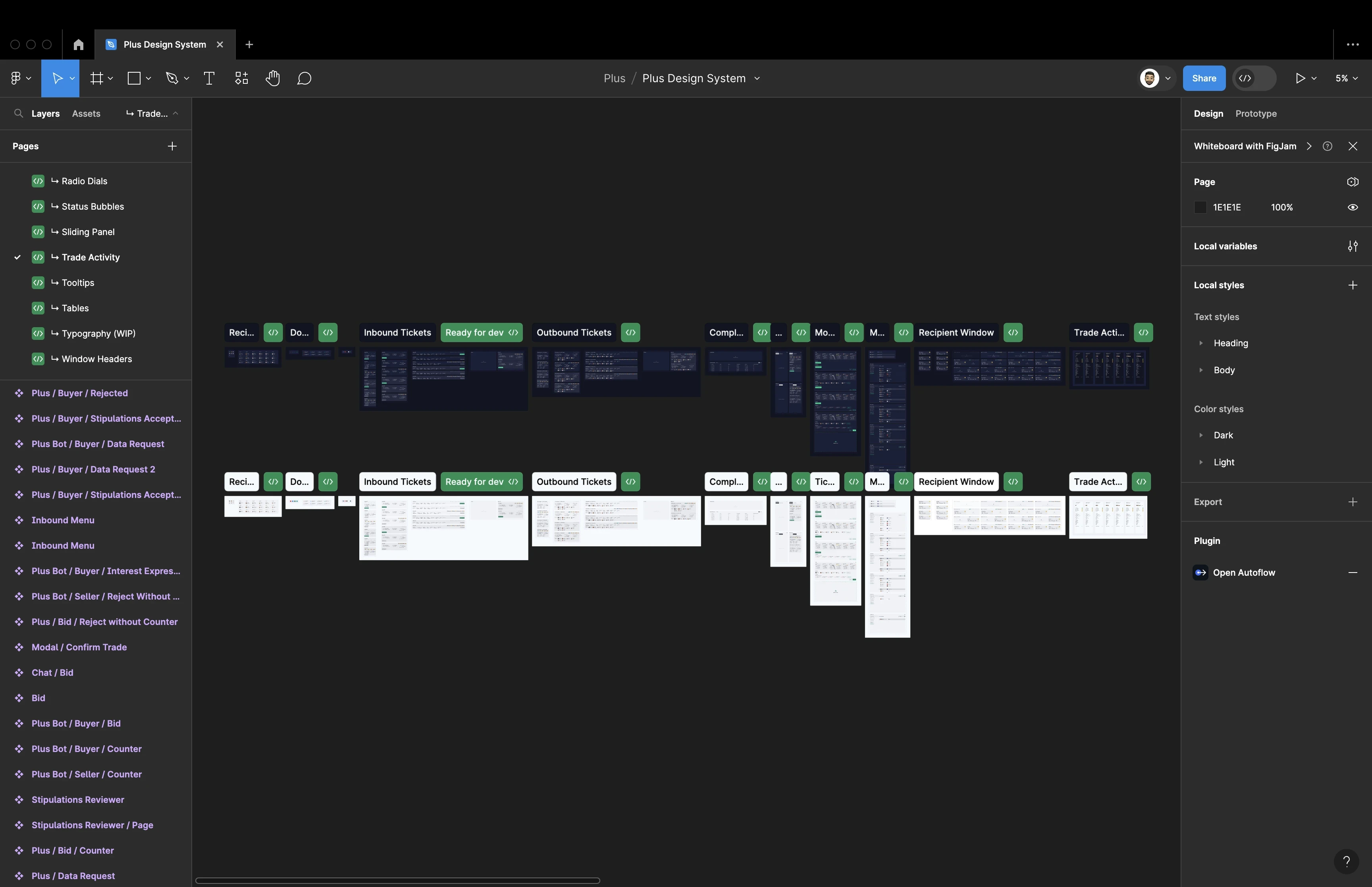
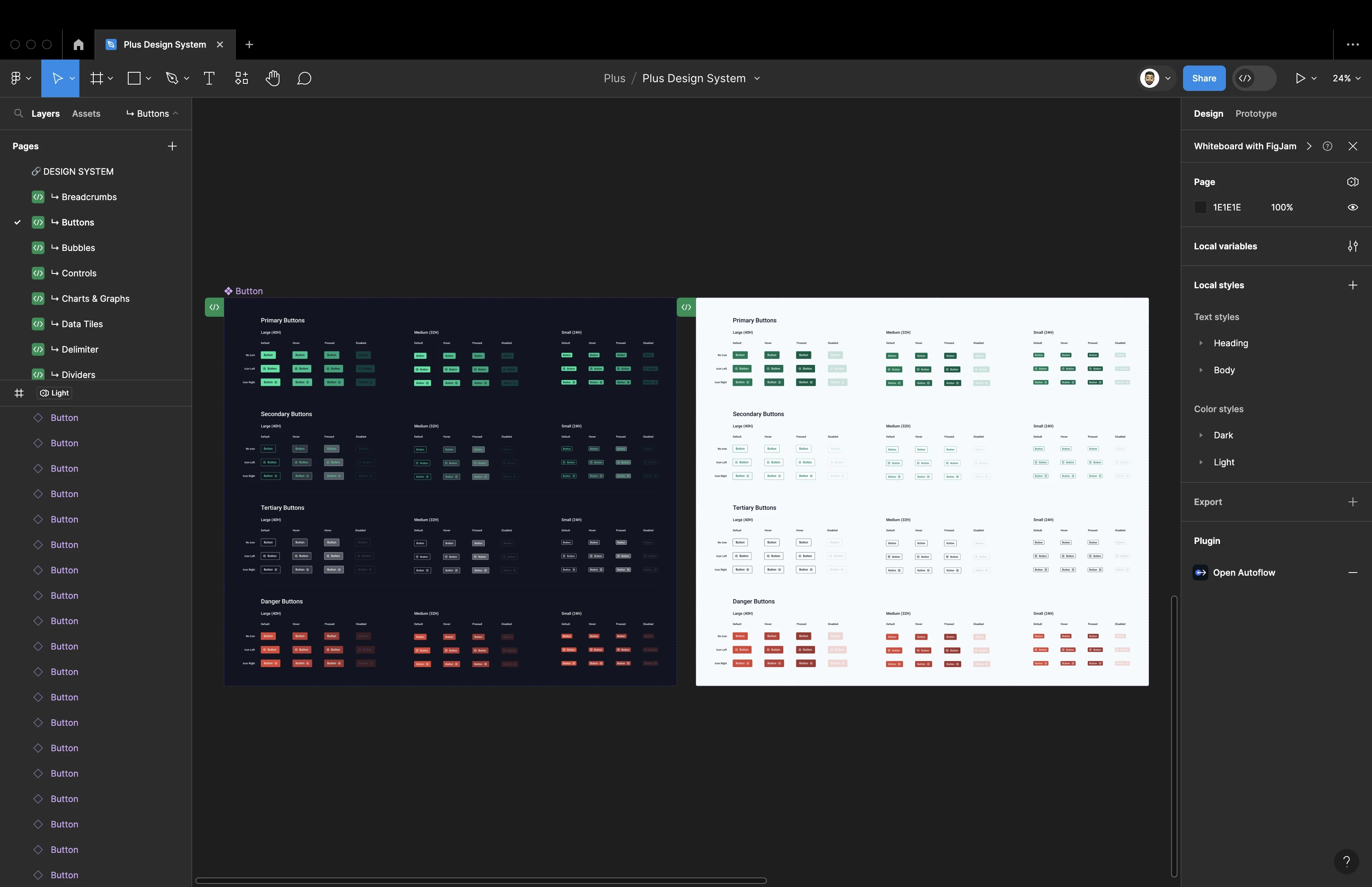
The Plus Design System library in Figma, with a page per component and light and dark colour styles
One library, a page per component, with light and dark styles held side by side.
Foundations

Design foundations

I worked on various foundational elements of the design system:
Typography
Creating a typography system.
Colour
Creating a themeable and accessible colour system that supports light and dark modes.
Layout
Creating layout and grid systems.
Icons
Creating an icon library.
Structure
Implementing atomic design principles and building the components in Figma.
Naming
Establishing token naming conventions.
Primary, secondary, tertiary and danger buttons at three sizes, in dark and lightButtons
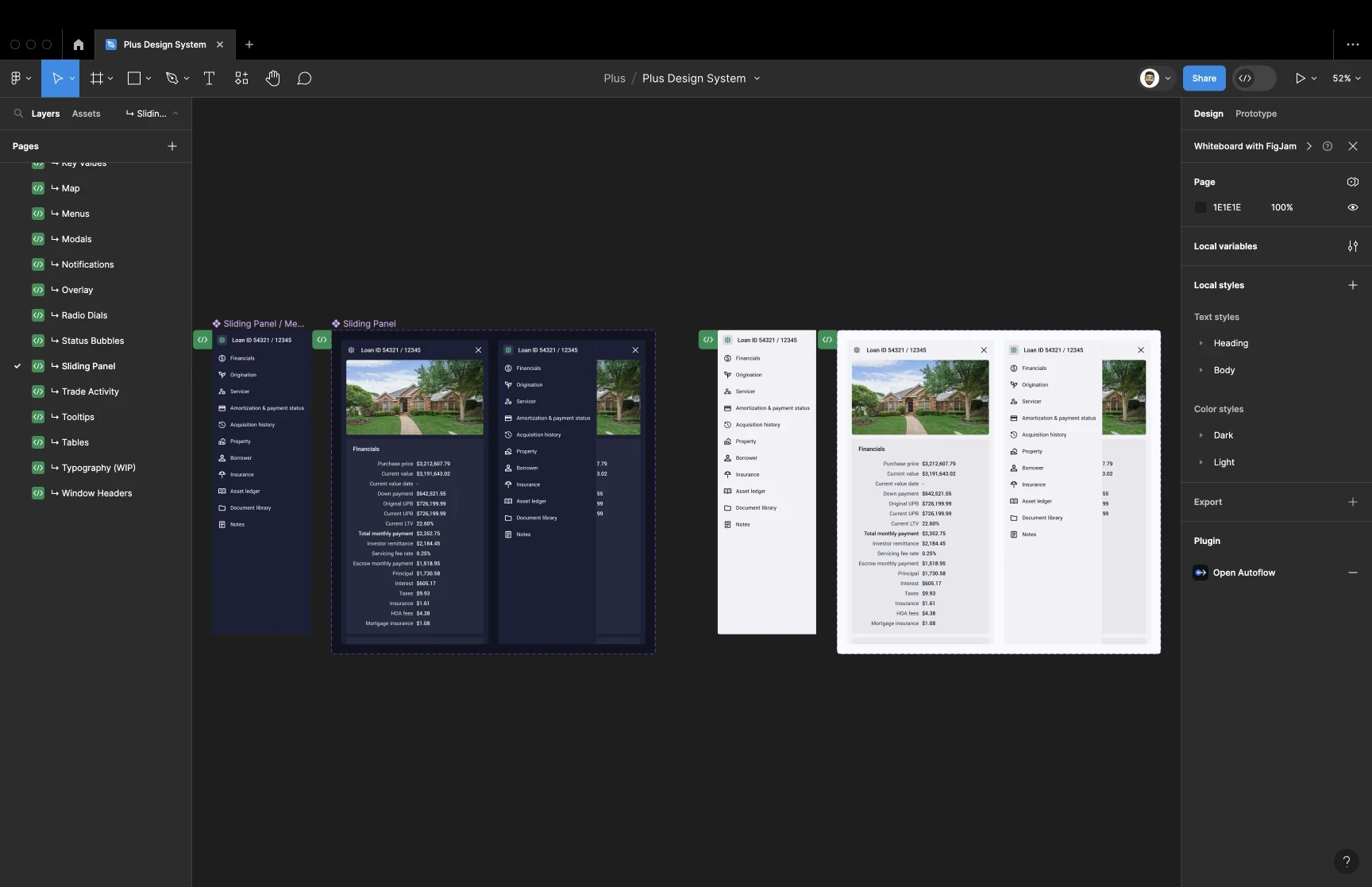
The sliding panel component in dark and light variantsSliding panel
Every component drawn in both themes, so light and dark were never an afterthought.
Solution

Tokens as the foundation

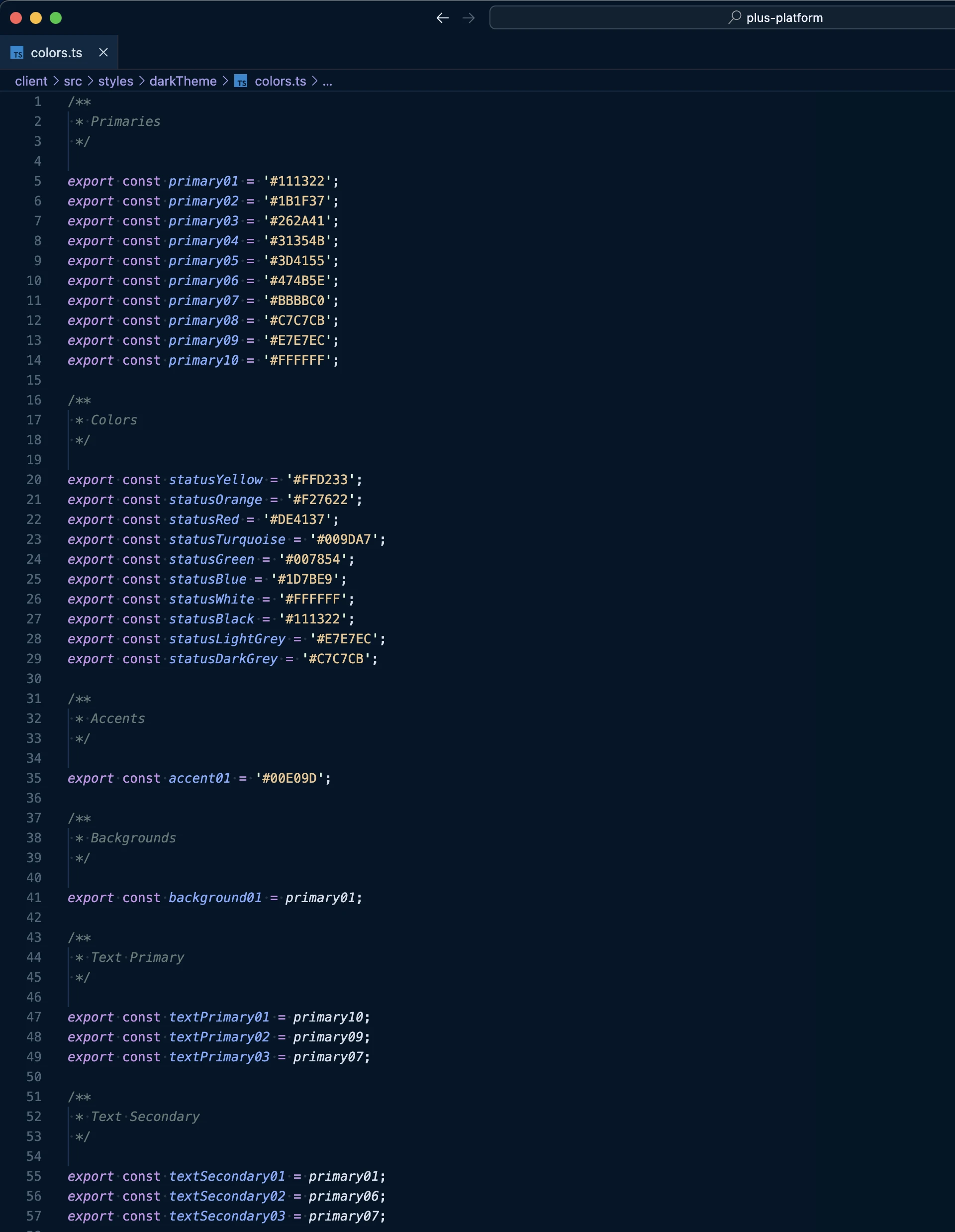
We assigned tokens to foundational elements of the design system in code. Working in this way let us build and iterate the design system and new features efficiently and create consistency throughout the product.
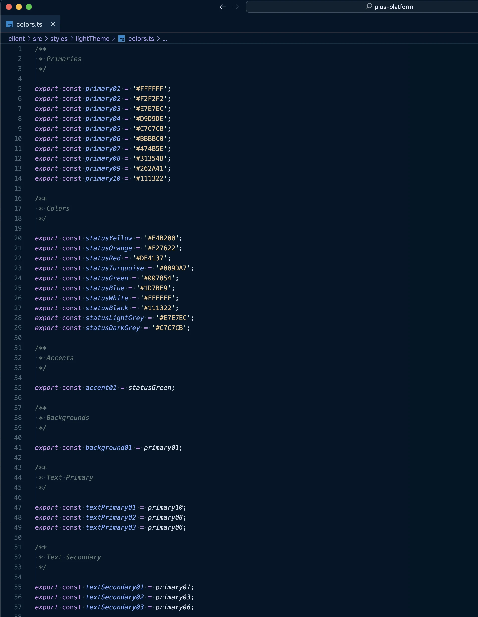
The light theme colour tokens in code, mapping primaries, status colours, accents and text rolesLight theme
The dark theme colour tokens in code, using the same names against different valuesDark theme
The same token names in both themes, so a component never needs to know which theme it is in.
Delivery

From Figma to Storybook

A design system created in Figma, or any design tool, is a design system incomplete. To create consistency in development, the design system needs to be mirrored in code.

As a collective, myself and the engineers dedicated to the frontend decided to use Storybook as our platform for building out our components.

I worked closely with several engineers to tokenise, review and sign off any new additions to the repository in Storybook.
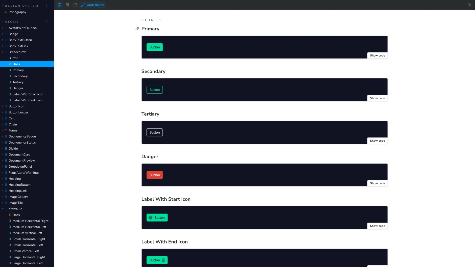
The button component in Storybook, with primary, secondary, tertiary, danger and icon label storiesButton
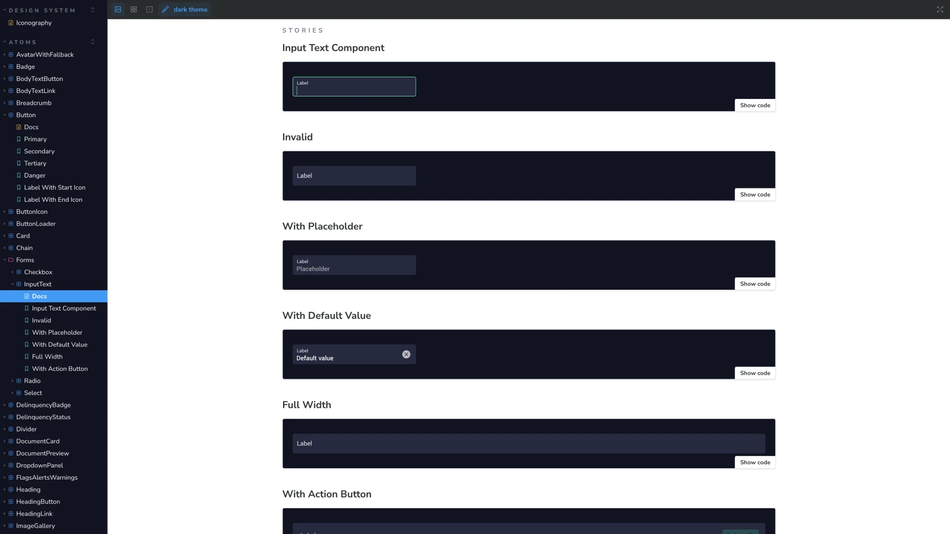
The input text component in Storybook, with stories for invalid, placeholder, default value, full width and action button statesInput text
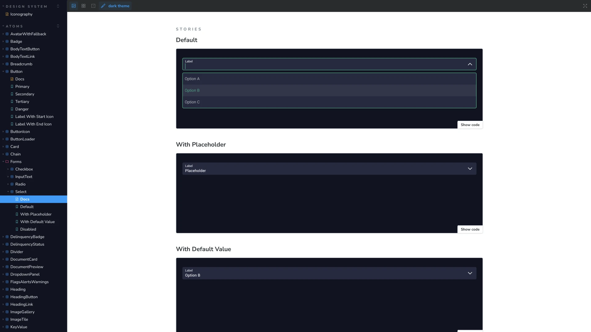
The select component in Storybook, with default, placeholder, default value and disabled storiesSelect
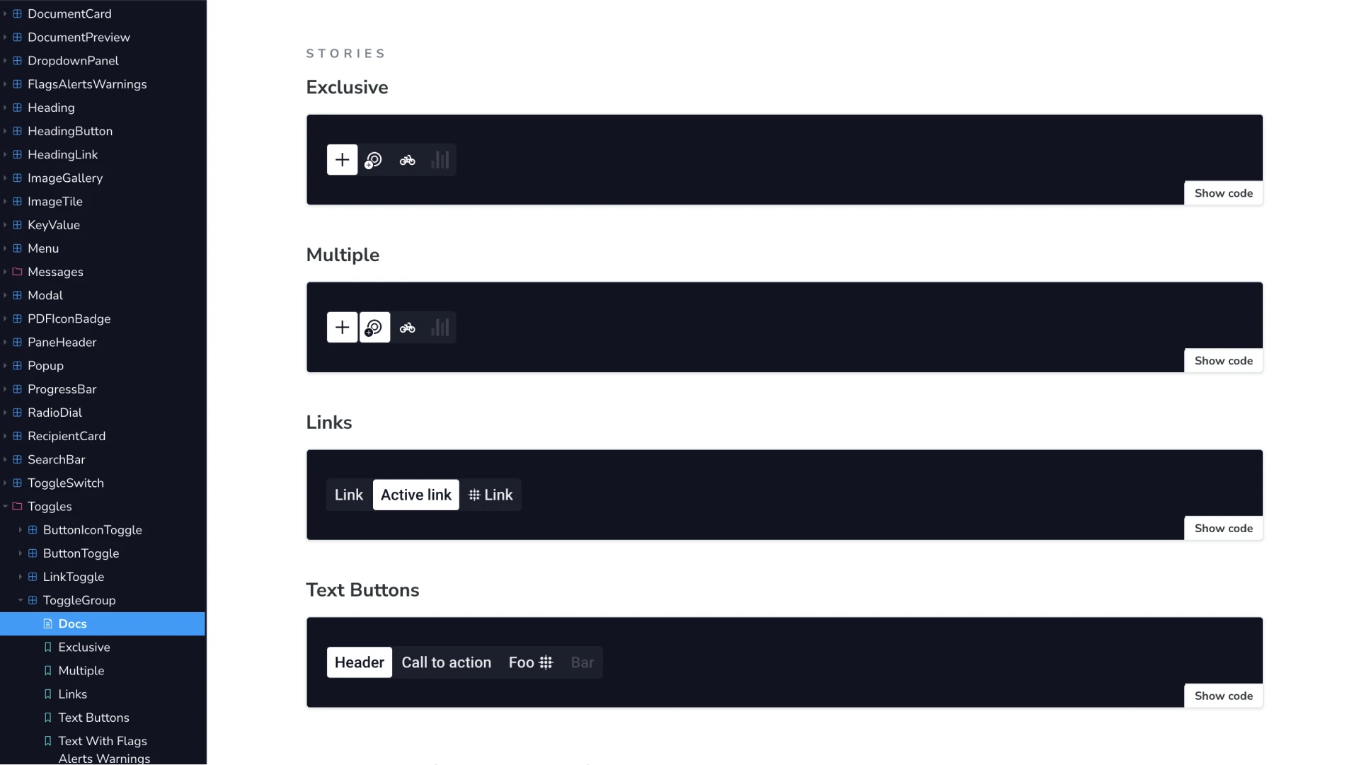
The toggle group component in Storybook, with exclusive, multiple, link and text button storiesToggle group
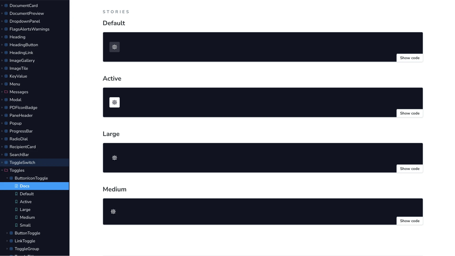
The button icon toggle component in Storybook, with default, active and three size storiesButton icon toggle
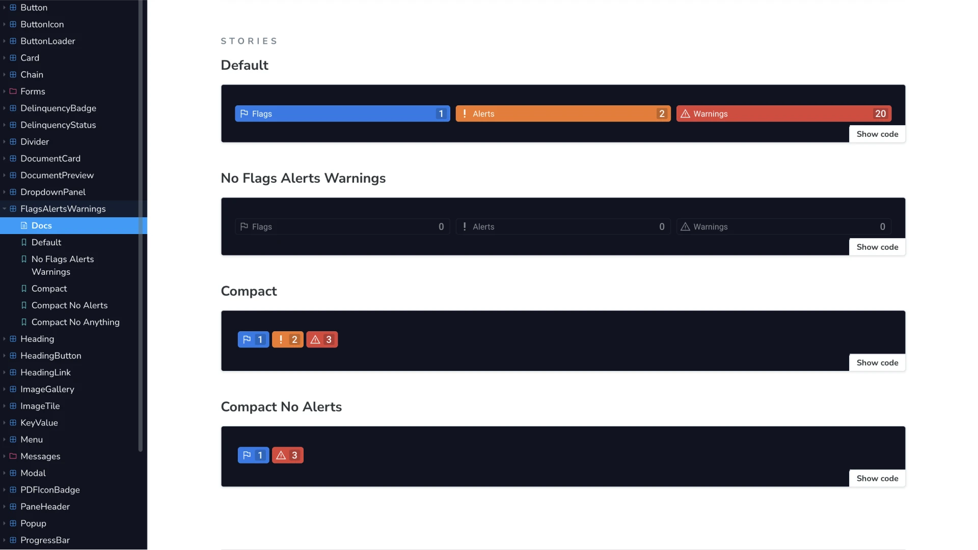
The flags, alerts and warnings component in Storybook, with default, empty and compact storiesFlags, alerts and warnings
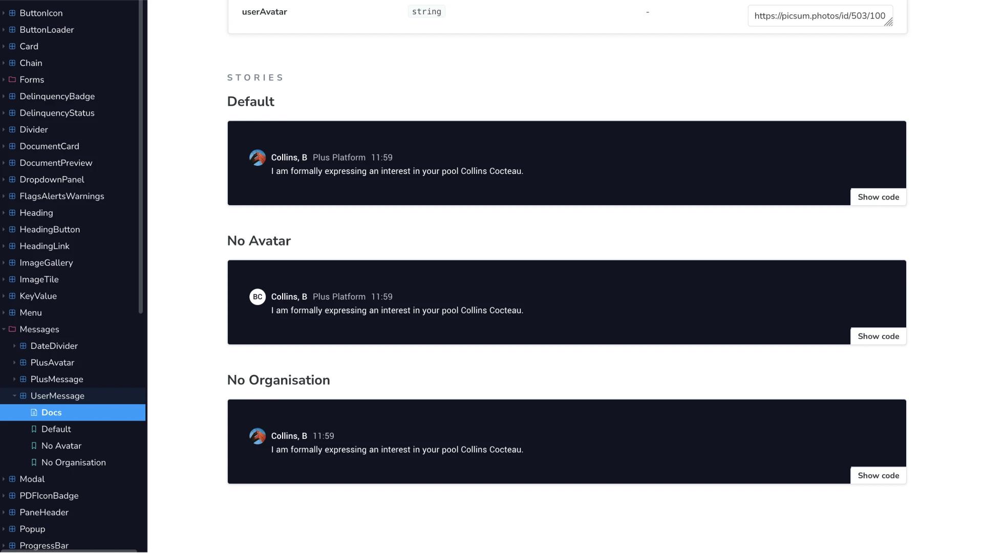
The user message component in Storybook, with default, no avatar and no organisation storiesUser message
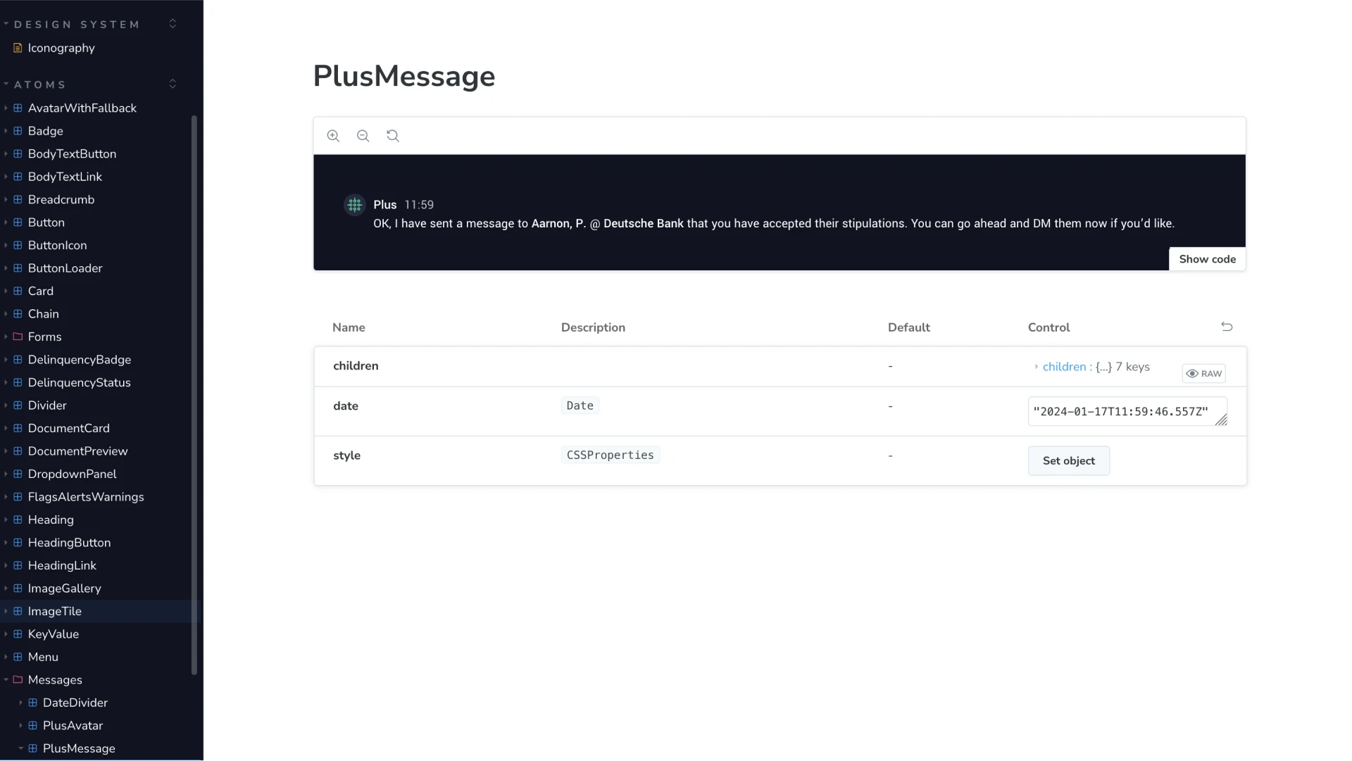
The plus message component in Storybook, showing its props table with names, types, defaults and live controlsProps and controls
Each component documented with its states and props, so engineers could see what already existed before building anything new.
Outcome

Adopted in full, by both teams

100%
Adoption in design
As the entire product was taken through a redesign, the majority adopted the new system, from typography to components to a themeable colour palette.
100%
Adoption in code
A design system is incomplete until it is built in code. I worked with a group of fantastic engineers to take the system from Figma to Storybook, allowing for streamlined development and iteration.
75%
Faster development
With the system in place, engineers could build new features efficiently instead of hardcoding around the gaps.
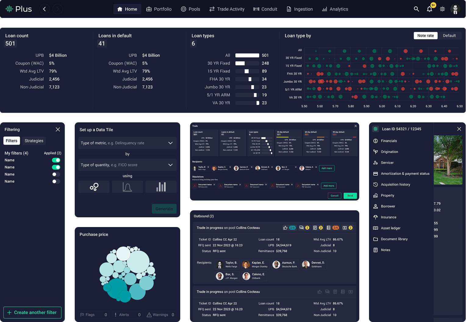
The Plus Platform dashboard, built from the design system components
The product the system was built for, assembled from its own components.

Testimonials

I had the pleasure of collaborating with Khayam on a design system for a highly complex project at Fathom. Throughout this process, he displayed an impressive ability to take on feedback and solve any issues I raised, while at the same time, taking ownership of the design. Khayam was a highly valued member of our team, and I look forward to collaborating again.

Ben GriffithTech Lead, Plus